The Importance of Beauty in Your Web or App Design
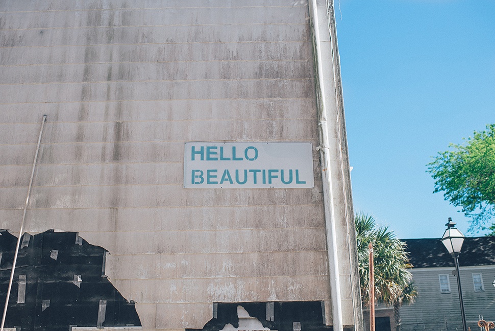
 Photo by Ian Schneider on Unsplash
“Beauty is a need; it's something we need and crave and gravitate toward.” - Gadi Amit
You want more customers. Your website and/or mobile app need to be updated. Users need to understand what you do and how they can benefit from working with you.
Just how important is that website to your business?
One study conducted by Forrester Research shows that your website conversion rate could increase up to 200% with a well-designed user interface.
So we know that digital products are important. Let’s take a look at making beauty a priority during your next project to drive business results you never could have imagined.
Functional beauty
A perfect design will balance functionality and beauty flawlessly.
Functionality is, of course, top priority when designing a website or mobile app. If it’s confusing and unusable, it doesn’t matter what it looks like.
However, to truly connect with the majority of your users, it should also be aesthetically pleasing. 38% of people will stop engaging with a website if the visual content or the layout is unattractive.
What is “beauty,” and why is it important?
The human connection
Beauty is a human construct. There is beauty in connecting with users, building trust, and convincing them to work with you or use your product.
Beauty isn’t making sure you’re following the latest design trends. It’s careful consideration of your brand, your users, and the space your product lives in.
“Something feels natural in a way or logical, when the design fits, I think it becomes beautiful.” - Richard Nielsen
When creating a new website or app, every aspect should be considered thoughtfully: typefaces, color palette, style of photography, and even the voice of the copywriting. All the choices you make, and ensuring these elements are consistent and harmonious across the product, work towards creating a more beautiful design.
The presence of a strong brand (when thoughtfully constructed and used appropriately) allows your users to create a relationship with your company.
Branded colors alone increase recognition by up to 80%.
Transparency is also extremely important, as an overwhelming 94% of customers report feeling loyal to brands that are completely transparent.
Another way to connect to the user and incorporate beauty into your product is to surprise the user. The unexpected can be quite beautiful and easily accomplished in your design. By simply adding animation into a website you can engage the user and elicit joy just from interacting with the site.
Providing value
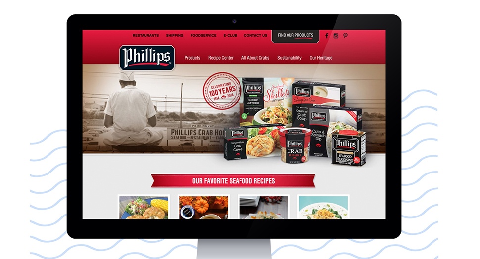
Beautiful design is a way to communicate the value of your brand and of your business. For example, when redesigning the website for Phillips Foods, we paid close attention to the existing brand and packaging design of Phillips products, and used the brand equity from those elements to elevate the look and feel of the site.

Using the same branding and elements from the food packaging immediately lets site visitors know that they are in the correct place to find more information about the products they buy and love.
The website also includes subtle roll over animations and an expandable “find a product” menu that makes the site more interactive (and therefore, more engaging) for users.
“The antithesis of beauty is not ugliness, it is carelessness.” - Stefan Sagmeister
Failing to prioritize the visual design while developing your digital presence will result in a poorer quality product. Your website can have all the right content and information your customer needs, but if it’s not properly designed to fit in with your brand, it can leave your audience confused, uneasy, or left wanting more.
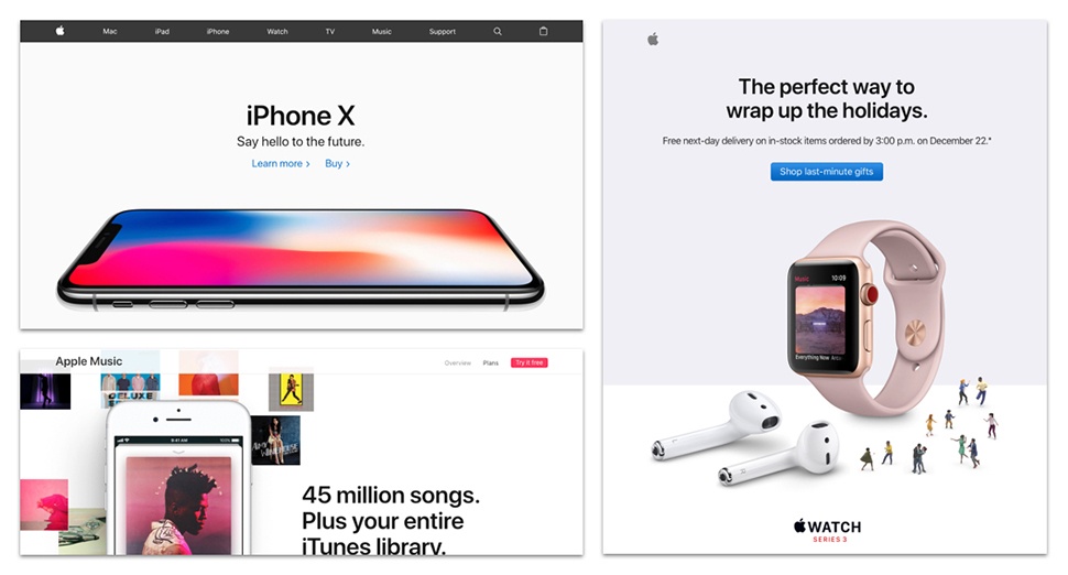
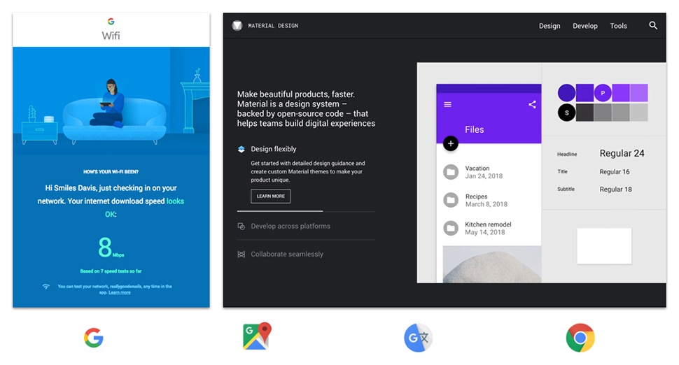
Industry giants like Apple and Google have carefully considered every aspect of their brands and ensure they are carried out across all of their products. This creates a trust with their users and even contributes to keeping them loyal.
 Apple Website, Apple Music, Apple Holiday Email
 Google Wifi Email, Google Material Design Website, Google App Icons
Achieving the balance
To ensure a balance between functionality and beauty, plan the design of your product from the very beginning. Invest in time to build your brand and incorporate those attributes within the design.
Beauty is your emotional connection to your users, and it is a powerful tool that can make or break your next project.
What’s the best way to bring beauty into your product? Let us guide you through your new project or next redesign.


