Subtle Web Animations and Ways to Incorporate Them

Animations can be used in subtle, smart ways that improve a user’s experience.
Stemming from issues with Flash in the early 2000s, web animation has caught quite a bad rap over the years. Besides its overuse, it wasn’t very search-friendly and consumed a lot of processing power. Luckily, it has made a subtle (and wonderful) comeback!
Web development trends are at a place where we can create smooth animations that work seamlessly across various platforms with tools like CSS3, Javascript, SVG, and HTML Canvas. Adapting atomic design principles also makes it even easier for designers and developers to think more modularly, allowing us to focus on how individual components behave, not just how they look.
Why use animation?
The number one reason to use animation is to benefit usability. Just utilizing simple animations can be a great way to get people to understand where they should be looking on a page. They give the user instant feedback, telling a user that they’ve successfully (or unsuccessfully) completed an action. Animations like these are starting to become more common, but the ultimate goal is to keep them in moderation. Overuse can lead to chaos and get in the way of valuable content.
Here are three common, subtle animation effects to get you started, along with some recommended libraries:
1. Soft Hover States
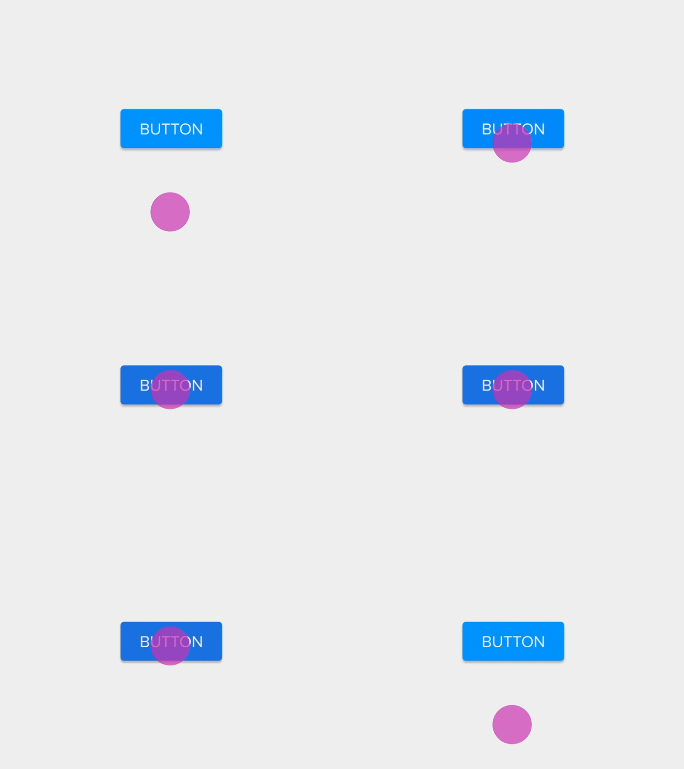
A hover state can add a lot of personality with only a little effort added to development. The most common element targeted with a hover state is a button. It’s a UI element that conveys action, so animating buttons is essential to interaction design. Slightly growing in size or fading to another color can call more attention to an action. The animation below is subtle, but powerful. With just a little extra time, the designer has created a button that feels more actionable and REAL. Unfortunately, since hovering isn’t a real thing on touchscreens, effects are triggered on tap instead. The effect here, if anything, should be very brief.
 Button by Ali Ali
A good start to get familiar with hover transitions can be found at Hover.CSS. It’s a collection of CSS3 powered effects that can be applied to almost anything.
2. Animation in Navigation
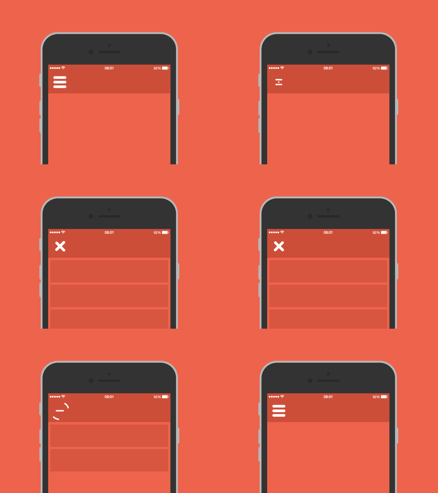
While a great idea especially for responsive websites, establishing a connection between static and active states is essential. The user should be able to understand what has changed, and how to change it back. Animation is essential for visually connecting the two elements and preventing jarring transitions. Hidden navigation menus are a recent trend that leverage animation. The menus are revealed by clicking on buttons (like the hamburger icon).
 Animation by Tamas Kojo
In the example above you can see the menu expanding and contracting -- mimicking the physical world. To help you with inspiration, here is a great collection of some HTML, CSS, and a little Javascript menus. It includes a neat little table of contents for accordions, dropdowns, flyout menus, and more. We’ve also been geeking out over an open source animation tool called Lottie. Created by Airbnb, this tool is perfect for designers that work on native iOS and Android app designs and want to inject a little more fun into their onboarding, UI, and transitions. Here is a Lottie library of animations ready for download (are you drooling yet?).
3. Smart Loading Sequences
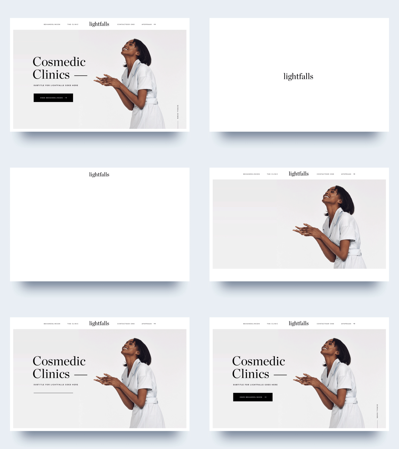
One of the oldest animation techniques on the web is all about distracting users from long load times. While they may not be needed for every website or app, loading animations can occupy (and even delight) the user while they wait for their next destination. Besides the trusty spinning loading indicator, there are way more creative ways to show loading progression. An example can be seen below. Notice how the logo appears and transitions to the top of the page before everything else follows. This subtle animation entertains the user, while also emphasizing brand. This effect can also be achieved by creating skeleton screens within your mobile or web interface. A fun (and useful) little library of animation loaders can be found over at Github.
 Animation by Rob Hutti
Animations are not just for big budgets
There are lots of great resources out there to get you started with animations that are subtle but impactful. A great way to start introducing animation to your website or app is by identifying your actionable UI elements and playing with the possibilities on hover, load, or click/tap. Our designers usually pair up with developers to talk animation, and with some strong collaboration we work together to get it right for the project and our clients. Drop us a line if you have any questions about what’s possible in the world of animation.

