The Gutenberg Editor and Its Impact on WordPress Websites

Last week, Mindgrubbers enjoyed a presentation held by Steve Morton, a WordPress Staff Engineer, as he explained the changes and functionalities of WordPress’s Gutenberg Editor.
Though Gutenberg is a now revered update to WordPress, the content block editor’s original release left engineers across the world feeling unsatisfied with its performance.
It accompanied the WordPress 5.0 update, which was added to the CMS (content management system) in 2018 to replace the Classic WYSIWYG editor. The initial reactions were…less than ideal, to say the least.
Following a slew of negative reviews about the Gutenberg Editor, WordPress went back to work on adapting the product to better fit the needs of its users.
The end result?
A beautiful content editor that allows users to modify a page and see what the final product will look like in real time. In contrast, the Classic WYSIWYG Editor relied on users to edit content in the backend of a website. This means edits can’t be seen until the page is previewed or published. The WordPress team created the Gutenberg Editor to revamp the content editing process.
Watch Steve’s presentation here to learn about:
- What the Gutenberg Editor is
- Why WordPress made fixing it a priority
- An in-depth walkthrough of the Gutenberg Editor
- How it applies to different job titles in our industry
- And more!
Introduction to Gutenberg
“Thanks for coming! If it wasn't apparent from my horribly creative title, today we're going to be talking about WordPress and the Gutenberg Editor. So first, what is it? What is the Gutenberg Editor, besides a product with a ridiculously gorgeous logo?

Gutenberg is the new default content editor for WordPress. It was added in WordPress 5.0, which was released in December 2018. It's based on a system of blocks and was written in React, which is a very popular JavaScript library originally created by Facebook.
This is notable only because WordPress is primarily written in PHP. It replaces the original WYSIWYG Editor, which we now call the Classic Editor, which we've been using since 2000. Now, you heard me right. You might be thinking, Steve, you said this was a new editor, but it's been out since 2018.
What gives!
Well…
“Terrible!” says @cheesepatrol. “Who approved this hot mess?”
“Garbage.” Says @josma “I only logged in to review this horrible product.”
“Horrible,” says @devilapp. “I'm happy I got laid off so I don't have to use this.”
Yikes.
“Leave it as an option for masochists.”
And my favorite one:
“I would rather stub a broken toe against the edge of a brick than use this editing mode.”
So, needless to say, it was not very well received when it launched in 2018. We've had our own issues and scruples with it early on, so we decided to hold off on adopting Gutenberg.
But if it's so bad, why am I telling you about it? Well, we've been starting to use it [Gutenberg] on some client sites more recently, and, well it's gotten a lot better, a whole hell of a lot better.
We're learning a lot and getting better at using it. So, before we go any further with this, I think a demo is in order. So those of you who have not seen Gutenberg yet, this will be your first time.
But first, before we dive into Gutenberg, let's quickly visit the Classic Editor for anyone that's not already familiar with it, just so we have a point of reference.”
The Demo
To watch Steve Morton demonstrate the development and design capabilities of the Gutenberg Editor, watch the walkthrough here!
You can find helpful tips and tutorials on how to name sections, navigate the editor, create content blocks, edit columns, and more.
Now, back to the presentation!
Related reading: 4 Steps to Prepare Your WordPress Site for Gutenberg
How Does Gutenberg Affect Working On WordPress?
“So taking a look through the demo, some of you might be wondering, “How does this affect my job?”
This is what you're all here for. So what I've done is I've broken down some of (what I think is) helpful information for people in a variety of roles because in my opinion, to make Gutenberg sites well, it really requires everyone to buy into it.
While these are specific to a particular role, I feel as though it’s important for everybody to know. I'm going to try to keep things kind of high level. I might go a little bit fast but bear with me.
Developers
All right. So for devs (developers) if you were like me and you saw those dozens of core blocks and all their different color and size options, you might be thinking “Oh, whoa, whoa, whoa, pump the brakes. That's a lot of styling work to do, a lot of things that the client could absolutely wreck the site with if not steered properly.”
Well, good news! They've thought of that. WordPress provides several methods for limiting options available for core blocks in addition to a couple of ways to just remove core blocks entirely, if necessary.
That way you don't have a client adding a block that isn’t styled or adding a color that invalidates their accessibility. We don't have to worry about that. If you guys would like some more information on this Alex Ball actually just did a fantastic Lightning Talk on this at WordCamp.
All right. Obviously, you can also create custom blocks. Custom blocks are written in JavaScript and depend on React. This can be a little bit of a learning curve if you haven't touched React before. For example, there are some ‘gotchas’ with static blocks where you have to very carefully depreciate the old versions.
Fortunately, ACF, per usual, is to the rescue. They allow you to create blocks purely in PHP if you need to. Generally, the JavaScript blocks are going to perform faster and have a much better WYSIWYG user experience, in my opinion. But in a pinch, ACF blocks work really well, they’re super easy to build and maintain.
Styling can be a little bit of a challenge with Gutenberg. You essentially need to duplicate all your styles for your blocks and your WYSIWYG elements on both the front end and the back end. Fortunately, we've learned some tricks and ways to scope our CSS so it's not as much of a hassle.
Honestly, if you’re just following our best practice recommendations using SCSS and BEM, you get there most of the way there. SCSS allows us to write the styles for each block once and then import them into both our back-end and front-end style sheets following BEM methodology and avoiding the overuse of styles with global scope keeps unwanted cascading to a minimum.
The Child Combinator Selector is also super handy here when trying to keep the WYSIWYG topography styles consistent without accidentally bleeding over into and overriding your block-specific styles. I know I said I was going to keep it high level. Sorry, I had to go a little deep on the CSS there, but next up are margins.
Designers
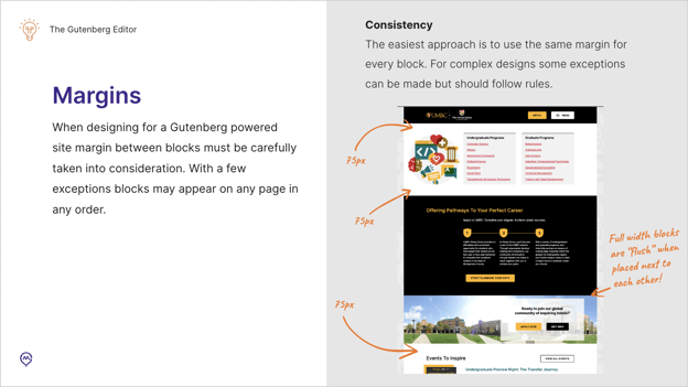
When designing for a Gutenberg-powered site, it's really important to take margins between blocks into careful consideration. With a few exceptions, any block can appear in any position on the site at any time, in any order. If you have blocks with lots of different amounts of margin padding between them, your results may vary.
We definitely recommend keeping your margins consistent across the site. Obviously, some designs might require a few exceptions. For example, this is UMBC.

While this isn't actually using Gutenberg, it is using a block-like approach. You can see that we have 75 pixels of margins between each of the blocks.
However, we have some special blocks that are full-width with a background behind them. It would look really weird if you put two of those next to each other and they have 75 pixels of dead space between them. So we made them flush.
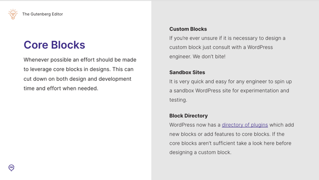
Now onto core blocks! Whenever possible, we should be trying to design to use core blocks.

This cuts way down on both design and development time and effort. As a designer, if you're ever not sure if a custom block is needed or not, just consult with a WordPress engineer. We are happy to help. We don't bite! I promise. We can also set up a sandbox site for you.
It's really easy and quick! If you ever just want to mess with some blocks or see which ones are available, just ask one of your WordPress engineers. There's also a block directory on the WordPress worksite now that allows you to see a bunch of plugins that either add blocks or add features to core blocks.
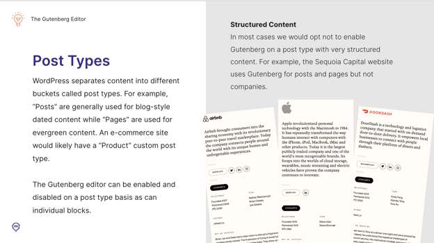
Now for post types. So I think a lot of you probably already are aware of post types and WordPress.

It's how WordPress separates the content into different buckets. Essentially, Gutenberg can be enabled or disabled on a post type-to-post type basis.
For example, on Sequoia, we use Gutenberg for posts and pages. But not for companies, because companies all pretty much utilize a very strict design and structure. There's not much variance between them. And the benefits of Gutenberg would kind of be lost on it. So for those, we just have a field-based entry.
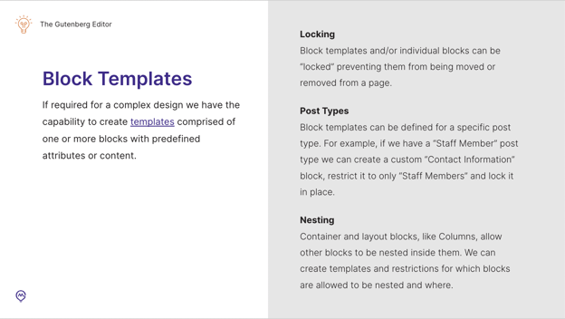
What about block templates? This is one of my favorite features of Gutenberg. They allow us to essentially create templates comprised of one or more blocks with predefined attributes or content.

We can lock a template or individual block in place, which either prevents them from being moved or removed from the page. Templates can also be made specific to a particular post type. For example, if we have a staff member post type, we could create a custom contact information block, restrict it to the staff member post type and lock it making it effectively locked in place.
Container and layout blocks can actually nest blocks inside of each other, like with columns. For example, if we create a custom container block, we can actually create templates for it and restrict which blocks are allowed to be nested where.
Related reading: 6 Design Principles and How They Influence Your Web Strategy
Project Management
All right. Moving on to project management. So, I can't say this enough:
I super duper highly recommend structuring tickets around blocks whenever possible.
By structuring tickets around blocks, as opposed to pages or templates, we easily match the cadence that we would want our designers or developers working towards on a Gutenberg project.
Likewise, I think naming tickets for blocks is a great idea because it sort of enforces a shared vocabulary between team members. For example, instead of [saying something like] “Hey, there's an issue on this page.” It becomes, “Hey, there's an issue with the call to action block”. It reduces the time it takes for a developer to figure out where they need to start troubleshooting.
This can also help with prioritization. Blocks that are expected to be used more frequently should be prioritized earlier in the project schedule whenever possible. I should also mention that some blocks can be easily grouped together. For example, topography elements like headlines, paragraphs, and block quotes, are easily handled at the same time.
Sales
Moving on to sales.
So, I hope I haven't caught anyone by surprise with this, but at least for now, we should expect that Gutenberg projects will require a bit of a higher level of effort than standard WordPress projects. However, with each Gutenberg project that we complete, we should be able to do better and work faster on the next one.
We've already begun to incorporate some of our lessons learned into our WordPress starter theme. It's also worth noting that, at least for right now, I highly recommend that if we know we're going to be taking on a Gutenberg project, that we make sure that a Senior Engineer who has some Gutenberg experience is going to be available to work on that, or at least consult on the project.
There are some cases where we would probably like to use Gutenberg, like if we have a big-name client, but I find it's actually easier to consider the occasions when we would not want to use Gutenberg. I hope it's really clear from this discussion that whenever possible, we're going to benefit ourselves if we know early in the sales planning and scoping process if we're going to use Gutenberg or not.
Here are a couple of key things to look out for that might be indicators that we don't want to use Gutenberg:
- If we have a non-tech-savvy client (although Gutenberg is awesome and powerful, it is definitely a bit harder to use than the Classic Editor).
So for clients that struggle with certain technology, this might not be the best use for them or best case for them.
- If we know we're going to have very structured content.
For example, product course catalogs. Those are typically going to use very standardized templates. They're not really going to benefit from Gutenberg. However, as we said in the design section, we don't have to use Gutenberg for every post type. We could have some that are using it, and some that are not. Hybrid approaches are super viable.
- I also wouldn't recommend using Gutenberg for a low-budget or quick turnaround project unless we can stipulate something like ‘no custom blocks for the project.’
The Future of Gutenberg
To wrap things up:
What does the future of WordPress look like? So, you may have heard earlier when I went to show you the Gutenberg editor, I had to disable the Classic Editor plugin. WordPress wants to retire that plugin. They want to remove official support for it, even though they keep moving the date back when they're going to do this.
Right now I believe that [will be] sometime in 2023, but it'll probably get pushed back again. Personally, I don't agree with this decision, because I think there are still legitimate use cases for the Classic Editor. Even if they do remove their support, I'm confident that there will still be community support in some way.
Lastly, WordPress 6.0, which was released earlier this year, added beta support for full site editing. Which is pretty scary to consider since you can basically edit your entire site. Header, footer, sidebars, content, everything with blocks. But with the block editor, I want to stress that this is still very, very, very much a beta feature.
We learned a lot about it at WordCamp US this September, though Gutenberg still has a ways to go! We probably won't see this as being viable for production work until a year or two from now.”
If you’re interested in seeing what the Gutenberg Editor could do for your WordPress website, contact the experts at Mindgrub today!

