When designing a website, there is a multitude of decisions to make.
How will we structure the homepage?
What content should be shown to our users first?
How will the top navigation menu be organized?
We’ve already established why your website should have a content strategy, but what comes next?
Web design is a crucial element of your overall web strategy. Though decisions are occasionally based on preference, the design of your website should reflect your business goals, all while adhering to the needs of your end user. Ultimately, design directly influences the success of a website,
Design choices can affect your website in several ways. If your site is inaccessible, users can’t navigate effectively. If your site doesn’t combine design with SEO best practices, users won’t be able to find you in Google results. If your website’s design is structured without your user in mind, you could be unintentionally isolating a particular user segment. In short, poor design choices can deter customers and impact revenue.
When partnering with an agency (like Mindgrub!) to build your website, it’s important to ensure that a design is pleasing to the eye and convinces your audience to take action. We sat down with Mindgrub’s resident Art Director, Emilee Beeson, to discuss the ins and outs of web design principles and how they can add value to your user experience.
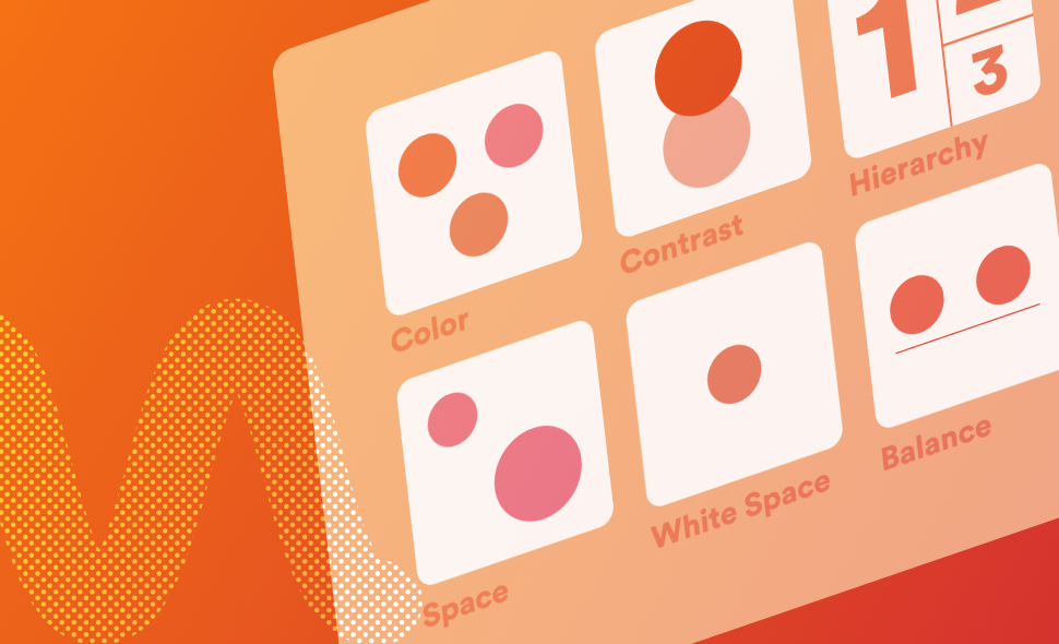
What are the 6 design principles that impact your website?
- Contrast
- Movement and Motion
- Patterns and Conventions
- White Space
- Balance
- Hierarchy
Related reading: 6 Ways Website Design Impacts Your SEO
Contrast
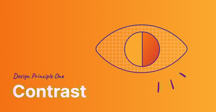
In design, contrast refers to the way elements interact with each other. More specifically, how they interact to make specific details stand out. If a designer wants to make a headline ‘pop’, they can add a higher level of contrast. But making typography on a webpage bolder does more than enhance aesthetics–-it’s also important for ADA compliance.
Nowadays, companies are required to make sure their websites are accessible, and the contrast on a webpage plays a vital role in accessibility.
Increased contrast means increased legibility.
This extends past those who have permanent visual impairments: It can also be for users who are recovering from recent eye surgery or who are viewing your website in the bright sunlight.
Contrast requires you to take your audience into consideration. Understanding what they see and how they see it are just as important as what is on a webpage, especially in terms of ADA compliance.
If you want to learn more about ADA compliance, read The Business Leader’s Guide to Accessibility.
Movement and Motion
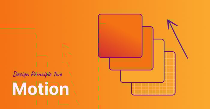
Movement and motion are huge parts of design! You might be thinking of the traditional use of movement, which is to create elements that carry the user’s eye over the design. Traditional movement refers to design elements such as gradients or stylized iconography (like arrows or lines). But in this case, we’re talking about animation and motion on a webpage. With animation and motion, we’re looking at moving elements like carousels or scroll animations.
Animation increases user satisfaction and adds a new level of interactivity to your web pages. By creating fluid motion through animated button clicks and menu drop-downs, your users are more likely to interact with your website.
Things that move perform better. They’re eye-catching, and now CMS (content management system) platforms support motion on websites more than ever. Microinteractions, hover states, and motions for iconography and illustrations are all examples of how to use motion in a digital experience.
These days, movement and motion are expected, not add-ons. Without it, you risk an outdated-looking website.
Patterns and Conventions
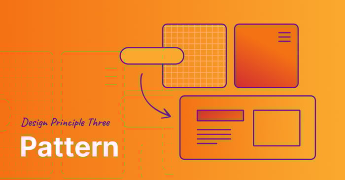
We love patterns, and we’re not just referring to a nice plaid or houndstooth. Patterns (also considered conventions) refer to the way design elements are structured. For example, a website’s top navigation is a pattern/convention that your users will interact with instinctually.
We use patterns on a website so users recognize and are familiar with specific formats. Consider a hamburger menu, a simple three-line element on the top of a webpage. Most users know that those three lines enable them to access more of the site, even without explicit copy accompanying the graphic.
With any website, a business can opt to break conventional website patterns in favor of a customized experience. When deciding whether or not to break one of these rules, it’s important to keep your audience in mind. If you’re designing a website for users that aren’t tech-savvy, stick to the traditional patterns so they have a better user experience. But if you’re designing a website for a group of trendy art students living in a large city, it can be fun (and lead to more conversations) if you break convention in favor of trying something new.
Remember, patterns are essential to a website, but sometimes it’s necessary (and exciting) to break the rules–as long as you’re keeping in mind what your audience needs.
White Space
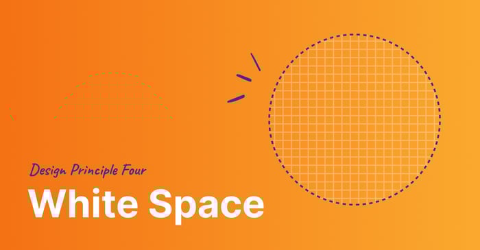
White space is the area of a design where there are no additional elements. It’s the “negative space” on your website. This design principle is almost entirely based on the preferences of a business, either choosing minimalism (a lot of white space) or maximalism (minimum white space).
"Think of your website as an infinite canvas. Take advantage of it and don't be afraid to take up real estate with white space!" - Emilee Beeson, Art Director
White space is breathing space.
There is an antiquated idea that all of your content needs to be ‘above the fold’ on a page. This assumes that your user is unaware that your website is scrollable! It can be especially beneficial to your user to only focus on a few key elements instead of attempting to ingest all of your content at once. This is where white space comes into play.
If you’re working with a good design team, you can be sure they will utilize white space tastefully, strategically, and in line with your brand’s minimalist or maximalist style. It’s meant to create a thoughtful user experience that carries your users through your website without overwhelming them.
Balance
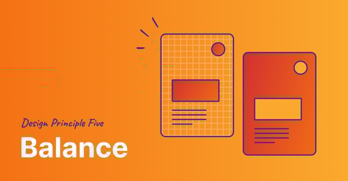
Balance relates to all aspects of your website’s content. More often than not, you create a design around the content that you want on a webpage. You need to be thoughtful about what content you are presenting to the user, and at what times. You don’t want to inundate your users with all of your content at once; balance inspires understanding and cohesion on a webpage.
These days, users don’t read web pages—they skim! According to the Neilson Norman Group, 79% of users skim a webpage. Using balance to create scannable pages helps your users easily digest your content.
Bite-sized chunks of content are easier to comprehend–and more memorable.
However, balance comes into play with more than just content. Consider how colors are used, how your elements of typography interact with one another (large headlines versus smaller body copy), and how your design elements (logos, icons, galleries, text blocks, etc.) are distributed.
There is rarely a correct answer, but the right balance for your website can be determined by referencing your brand guidelines.
Hierarchy
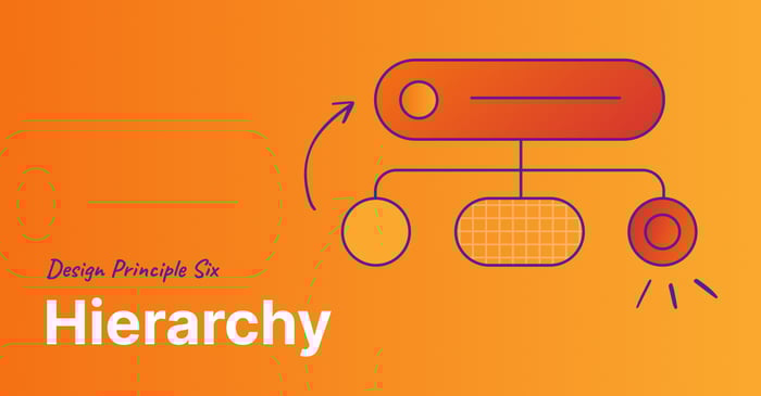
Hierarchy uses size, color, and placement to draw attention to one element over another.
Imagine there are 10 people in a room. They’re all shouting at you, vying for attention. You can’t understand what they’re saying. But if you designate one person to speak first, and create an order, you can better understand the points each individual is trying to get across.
Hierarchy on a website utilizes a similar tactic. Creating a structure for your content allows your users to better understand your message, starting with what’s most important.
Related reading: What is Brand Governance? 5 Principles for Managing Your Brand
Mindgrub takes a down-to-earth approach to design. We collaborate with your team to make your website beautiful. Contact our team to get started on your website design today!

