6 Ways Your Website Design Impacts SEO

Raise your hand if, as a marketer, you’ve been handed a fully-designed website and asked to “do SEO” to it.
It’s safe to say that the person who tasked you with making some SEO magic was probably operating under the assumption that search engine optimization is only about keywords and backlinks, rather than about how the overall site is designed.
In reality, while including keywords in your website copy and earning links to your site from high-quality domains are both important, there are more factors that matter in SEO - many of which have to do with the design of your website.
Here are six elements of your web design that can affect your organic search performance, and how to optimize each:
Navigation
Your website’s information architecture plays a crucial part in your user experience. How quickly and easily your users can find the information or functionality they’re looking for is reflected in metrics such as your bounce rate (the percentage of visitors who leave without viewing any other pages on your website).
If you have a high bounce rate, it could be due to the way users can (or cannot) navigate to relevant content or complete a desired action.
Besides causing you to lose out on potentially relevant leads, your bounce rate has a direct impact on your rankings. Search engines interpret a high bounce rate as a sign that your website isn’t meeting the expectations and needs of their users, and your rankings for important keywords will be impacted accordingly.
Having a clear, hierarchical website infrastructure also makes it easier for search engines to crawl your website and determine how the content on your website should rank in search engine results pages (SERPs).
Search engines rank web content based on “expertise, authoritativeness, and trust,” meaning the more you can address a topic that is relevant to your business, the more likely you are to rank higher in search engines for that topic.
By creating categories and subcategories of your content, you’re not only helping your users find what they need, but you’re also sending a signal to search engines that you’re the best resource to address what their users are searching for.
Images and videos
It can be tempting, given all of the great camera and video technology that’s out there, to add as many of the most beautiful, high-resolution photos and videos to your website as possible. Unfortunately, huge image and video files can take a long time to load if they’re not optimized properly.
Unsurprisingly, search engines take site speed (and page speed) into account when determining a website’s ranking on results pages. Again, their ultimate goal is to provide a positive experience for their users, so they don’t want to send them to a website that takes too long to load.
How long is “too long?” According to research conducted by Google in 2020, the bounce rate probability increases to 58% if your page takes longer than 3 seconds to load. Moreover, a one-second delay in load time equates to a 7% drop in conversions, an 11% decrease in page views, and a 16% reduction in customer satisfaction, on average.
There are a number of free tools out there that help marketers and developers understand their desktop and mobile site speed. One of those tools, Google PageSpeed Insights, analyzes your site content and provides recommendations, in priority order, to bring your page speed within an acceptable range.
When optimized for web and mobile viewing, images and videos can increase engagement and drive conversions. Monitoring how new and existing graphics impact your page speed will help ensure your organic search performance isn’t being affected by them being there.
Fonts
If you’re worried that Google will judge your font choice and rank you accordingly, you can relax; your choice of font type will not directly impact your organic search rankings. However, your font choices do impact your user experience, which (you guessed it) does have implications for SEO.
Using too many different fonts, fonts that are difficult to read, or font sizes that are too small (or too big) to be read easily all decrease the quality of your user experience. That’s something that search engines take into account.
When performing a font audit, make sure (a) your fonts are legible on all devices and (b) consistent with your brand across all properties. A cohesive, coherent experience will keep your bounce rate low and send a positive signal to search engines.
Mobile responsiveness
In today’s world, having a responsive website is non-negotiable. In a lot of organizations, however, the mobile experience is still deprioritized, relative to the desktop experience.
Why might that be the case?
Over 50% of all website traffic was generated on mobile devices in 2018, but today, due to the ever-increasing rate of mobile phone users, that number has increased tremendously. It is expected to rise even further. However, not all industries reflect that global average. Most B2B companies, for instance, whose buyers surf during the day, report a significantly higher percentage of desktop traffic than mobile.
So why does mobile still need to come first?
In March of 2018, Google announced that they will index the mobile version of a page first, “to better help our - primarily mobile - users find what they’re looking for.” That means your mobile content needs to load quickly and be optimized for consumption on a smaller screen, regardless of whether or not a majority of your site sessions take place on a desktop computer.
Google has a “Mobile-Friendly Test,” which, in addition to a mobile-friendliness rating, provides mobile usability reports and resources that can support all of your mobile content initiatives.
Header hierarchy
Today’s online readers expect to find the information they’re looking for faster than ever: only 16% of users read website content word-for-word.
Headers provide structure and help give visitors an idea of the content you cover on any given page, which makes them less likely to bounce before reading more.
Furthermore, while the importance of including keywords in header tags (H1 through H6) has come into question, 80% of first-page results on Google use an H1 header. Not having one is like publishing a story without a title; the reader has no idea if the story will be relevant to them or not, so they’re pretty unlikely to dive in.
To get an idea about how headings are used on your website and find opportunities to improve, use a solution such as SEMRush’s Audit Tool or Screaming Frog.
Layout consistency
HubSpot recently conducted a test on the impact of changing its content layout on SEO. After a year of plateauing organic search traffic, they wanted to uncover (a) how they could rank for more featured snippets and (b) how to start increasing their rankings for important keywords.
While their actions were part of a multi-step process, one of the changes they made was to standardize the layout of their blog posts to make it easier for search engine spiders to crawl their content.
The idea to change the design of their content came from the success of Wikipedia, which owns the highest percentage of featured snippets on the web (11.2%). The layout of every article is the same, with the first paragraph showing up most often in featured snippets and voice search results.
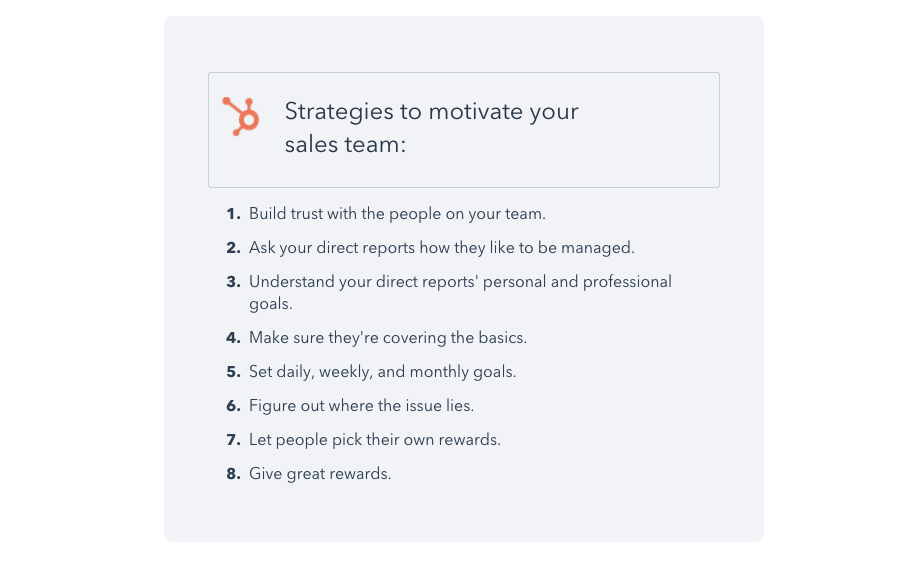
One of the biggest changes HubSpot made to their content was adding a simple, standalone list of the content covered in the article to the top of every post:

The results of their tests indicate that there’s a lot to be said for reconsidering how your content is presented on a page. They won 8-12% of the featured snippets they optimized for, up from just 1-2% previously.
The lesson learned is this: How easy you make it for users to understand the relevance of your content will mirror how easy it will be for search engines to crawl your site. What’s good for users will be good for your organic search performance, too.
In Conclusion
We’ll practice what we preach and sum up our review of how design factors impact SEO with this simple list:
What Elements of Your Web Design Impact SEO?
- Website navigation
- Images and videos
- Font choices
- Mobile responsiveness
- Header hierarchy
- Layout consistency
Our team of marketing experts starts every project with a review of your website for SEO opportunities. Want to start optimizing your website? Drop us a line today.

