
From an episode of Food for Thought to an infographic series, we’ve been talking a lot about the importance of accessible web design lately. And for a good reason. Did you know that according to the World Health Organization an estimated 2+ billion people will require assistive technology by 2030?
One in four US adults reported a disability in a 2016 CDC survey.
If your website isn’t accessible, you’re missing out on revenue from a large chunk of the population and could be at risk of an accessibility lawsuit, the number of which tripled from 2017 to 2018.
Lucky for you, designing your site with accessibility in mind doesn’t have to be difficult, and it will improve usability for all. To prove it, we’ve pulled seven standards from the Web Content Accessibility Guidelines (WCAG) that will show you how accessible web design creates a better experience for every user.
Here are the WCAG standards we’ll cover:
- Standard 1.3.2 Meaningful Sequence
- Standard 1.4.3 Contrast (Minimum)
- Standard 1.4.11 Non-text Contrast
- Standard 1.4.10 Reflow
- Standard 2.2.1 Timing Adjustable
- Standard 3.3.2 Labels or Instructions
- Standard 3.3.4 Error Prevention (Legal, Financial, Data)
WCAG Standard 1.3.2 Meaningful Sequence
Meaningful sequence refers to how an application is designed and created. Successful design and development consider how assistive technologies, specifically screen readers, access and programmatically render information.
In other words, if a person was using a screen reader to navigate your site, you would want to make sure the information is read to them in the correct order.
Screen reader users use certain keystrokes in conjunction with their language processing technology to access information. Some of these keystrokes include using the tab key to announce interactive elements and the reading keys to read content on the page.
Typically, when a user with a screen reader first lands on an application, they will use the reading keys to hear what appears on the screen. This includes any textual content and interactive elements in the order that they appear visually.
Imagine if the navigation was at the bottom of the page? A person interacting with your site via a keyboard would have to tab to the bottom of the page each time they want to interact with a different area of the application.
If your content isn’t arranged in a meaningful sequence, the user - impaired or not - is likely to be confused and disoriented.
WCAG Standard 1.4.3 Contrast (Minimum)
Have you ever struggled to read something because the font is yellow on a white background? Imagine how someone who has low vision feels, especially those who have a color vision deficit.
This WCAG criterion establishes a minimum contrast ratio: a ratio of the lightest color to the darkest, or foreground to background. The visual presentation of text and images that contain text should have a contrast ratio of 4.5:1 for any text that is 12pt or below, and 3:1 for text larger than 18pts.
In order to test contrast ratio, you’ll need to download a tool. My personal favorite is the colour contrast analyser, which comes with the Web Accessibility Toolbar (WAT).
Another effective resource is the wave tool, a Google Chrome and Mozilla Firefox extension that checks for the contrast of textual information on a page as well as other aspects of accessibility.
Additionally, you can inspect the foreground and background colors of textual information and input them on the webaim checker to analyze color contrast. These tools will ideally provide the same result.
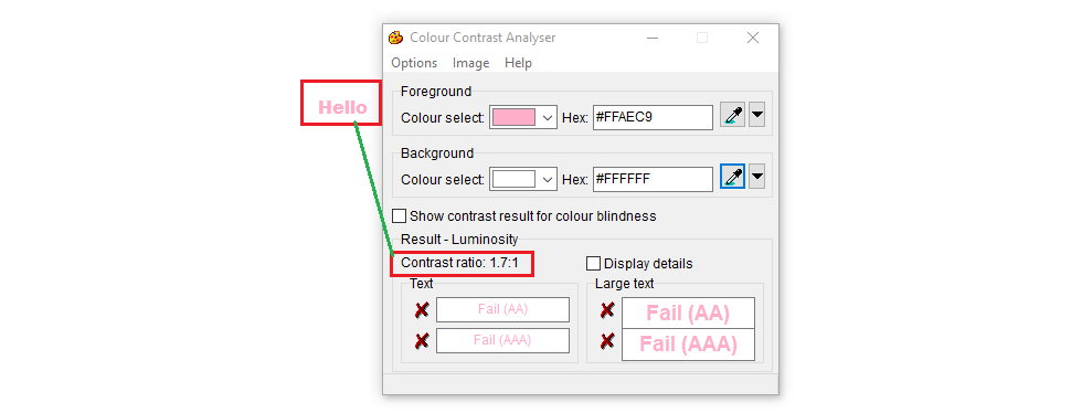
Above is an example of a textual element that does not meet the standard. This text fails because the contrast ratio of the foreground to the background, 1.7:1, is below the 4.5:1 standard for 12pt text.
I don’t know about you, but if I see light pink text on a white background, I’m not likely to read it. Meeting this minimum contrast ratio ensures your text is legible and encourages all users to stay engaged with your content.
WCAG Standard 1.4.11 Non-text Contrast
We discussed the contrast ratio for text and images of text, but what about non-text content, like buttons, links, and form fields?
Why are the two separate you may ask?
With user interface elements and graphics, the color could be indicative of the status of your interaction or the graphic element itself could be conveying vital information.
For example, if the contrast ratio is not appropriate, a person with a vision impairment may not be able to tell that certain words are hyperlinked, or that a checkbox has been marked on a form or survey.
The contrast ratio for such non-text elements is 3:1.

The above is an example of a failing element. It fails because the contrast between the yellow and white is only 1.2:1.

In this second example, the contrast ratio is met, so this element satisfies the accessibility criterion.
Low-contrast items are likely to be skipped over or missed by your user. By introducing a higher-contrast, you ensure that all of your users will be able to easily distinguish and comprehend your buttons, links, and graphics.
WCAG Standard 1.4.10 Reflow
I know you’ve probably heard of responsive design! But, in case you haven’t, this simply means designing for all platforms - mobile, tablet, and desktop.
The reflow criterion states that the user should not have to scroll in multiple directions to receive information.
Have you ever opened a website on your phone to find that it isn’t mobile-friendly? To read the homepage, you have to scroll all over - left to right, up and down. It’s a big pain, isn’t it?
This can be particularly annoying for someone with low vision, who may need to zoom in more on any given site. Scrolling from left to right then top to bottom can negatively impact their experience and cause disorientation. Addressing this criterion is a no-brainer, and will definitely make for a better experience for every user.

WCAG Standard 2.2.1 Timing Adjustable
I need more time! Filling out time-sensitive forms can provoke anxiety. Often times users with an impairment need more time to complete tasks or forms than someone without a particular impairment requires.
A user with a motor impairment, for instance, relies on the keyboard to access form fields and does not have the convenience of using the mouse to quickly navigate to specific parts of the form. They have to use the tab key to access every element.
A user who is blind will need to listen to all the content on the page and use assistive technology to input data. A user with a cognitive impairment may need a little more time to read and understand the content.
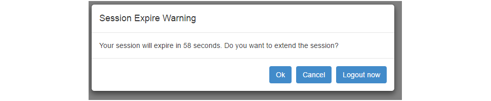 Photo: Code Project.
Allowing time extensions doesn’t just benefit these users; it benefits all users.
Have you ever been filling out a form with sensitive information, and clicked over to another tab to look something up or walked away from your computer to grab your credit card?
You’d be pretty frustrated if you clicked back to the form only to find out that your session expired, all progress was lost, and you need to start over.
It is vital that users be able to extend their time if needed. In this way, designing for accessibility is best practice for designing for the web.
WCAG Standard 3.3.2 Labels or Instructions
Ever received an error for entering the right data but in the incorrect format? For typing your phone number without the area code, or with dashes when they only want numbers?
Don’t you wish you knew the proper format to begin with?
This criterion is pretty straightforward - if you’re asking a user to input information, you should provide instruction or a label specifying what you’re looking for and the required format of the answer.
Doing so will avoid confusion and frustration, and it’s just good practice when creating forms.
WCAG Standard 3.3.4 Error Prevention (Legal, Financial, Data)
This criterion states that users need to be able to reverse, verify, or confirm any submission that is legally or financially binding.
To check for this, ensure that the user is able to do one of the following:
- Cancel an order or submission (reverse)
- Receive a full page of user-entered content to review and correct before final submission (verify)
- Confirms that the populated data is correct (confirm)
This reigns true for every user.
If you mistyped your address when ordering something, wouldn’t you want to be able to review your submission? Or cancel it before it’s sent to the wrong state?
From the busy mom filling out a form with one hand while carrying her child in the other, to a person with a visual impairment using talk-to-text, being able to reverse, verify, or confirm data submissions benefits everyone.
Don’t stop here
These are just a few Web Content Accessibility Guidelines that, if implemented, will benefit all of your users. It’s a great place to get started if you’re looking to make your site accessible (and we really hope you are).
Don’t stop with these guidelines though.
Designing for accessibility is designing for the web as a whole, and by becoming compliant, you’re ensuring that anyone and everyone can navigate your site with the utmost ease.
Want more accessibility content? Download our ebook, The Business Leader's Guide to Accessibility, or check out our accessibility infographics on Instagram.

