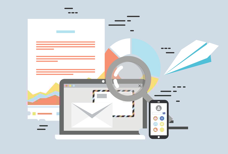
In honor of Global Accessibility Awareness Day (#GAAD) and the one billion people worldwide who have disabilities, we’re sharing seven quick tips for designing emails with accessibility in mind.
- Keep your font choice simple, sizeable, and spacious
- Contrast is your friend
- Alt text, alt text, alt text!
- Be careful with images of text
- Design responsively
- Add context to your links
- Go easy on the animated elements
Tip #1: Keep your font choice simple, sizeable, and spacious
Script-style fonts can add a fun, decorative touch to your email communications, but those all those curly-qs can make for some hard-to-decipher text. Stick to web-safe fonts that are easy to read - and will render in all email clients.
Once you’ve selected your easy to read font, make sure you’re using a large, legible font size. Itty bitty tiny words like this strain everyone’s eyes, especially those with visual impairments.
A general rule of thumb is to set body copy to a minimum of 16pt, and headers to at least 22pt.
Don’t forget about line spacing: at least 1.5 within a paragraph and 2 between paragraphs.
Tip #2: Contrast is your friend
You want your text to stand out from the background.
Hmm let’s try again.
You want your text to stand out from the background.
Much better, right? This illustrates why contrast is your friend.
To get a little more technical, let’s talk about contrast ratio. Contrast ratio is a ratio of the foreground (text) to the background. Any text size 12pt or below should have a minimum contrast ratio of 4.5:1. Text larger than 18pt should have a minimum ratio of 3:1.
The same 3:1 ratio applies for non text elements - like charts, buttons, infographics, and icons.
So how can you test the contrast ratio of elements in your email? With a tool like the WebAIM Contrast Checker. Just type in the hex codes for your foreground and background colors, and it’ll instantly tell you whether or not you meet this accessibility standard.
Tip #3: Alt text, alt text, alt text!
If your email contains any of the following,
- An image
- A chart
- A diagram
- A gif
- A logo
- Anything other than plain ol’ text
you need to be writing alt text. Alt text provides a textual description of the visual element, so that a person using a screen reader can still receive equivalent information.
Plus - these days many people have images blocked, either by their email client’s default settings or by personal preference.
To write good alt text, describe what the element is in detail, so that the person who isn’t viewing your image/chart/diagram/gif/logo/non-text item still knows what’s going on.
Tip #4: Be careful with images of text
When it comes to getting your content to render in different email clients, wouldn’t it be so much easier if we could just drop a few lovely, customized images into the body of our email and be done with it?
Unfortunately, images of text don’t work so well for email - and not just from an accessibility stand point. You never know who has their inbox set to block images or which clients are doing it by default.
What’s more, images of text can set off spam filters. Spammers used to put text into images to get around text-based filters. As a result, many email clients mark image-only or image-heavy emails as spam.
It’s best to use images of text sparingly. When you do use them, make sure that your alt text includes the text from the image, or that the long alt description, <longdesc> is used. Another option is to include the text directly under the image of the text.
Tip #5: Design responsively
Unless your email analytics tell you that 100% of your emails are viewed on a desktop computer - and I would hazard a guess that is not the case - your emails absolutely, no ifs, ands, or buts about it, must be responsive.
Before you hit send on that next email, run some testing. Either manually, by viewing the email on your personal phone, tablet, and desktop, or with the help of a tool like litmus or HubSpot. See how your content renders on different devices. Make sure you can view all text in a single column, and you don’t have to scroll in multiple directions to view all the content.
Tip #6: Add context to your links
Anytime you hyperlink a bit of text, the purpose of the link should be crystal clear to the user.
For instance:
That is not very clear. As the reader, you have no idea where that link will take you, or why it’s there.
Instead, consider:
To learn more about web accessibility, check out 7 Ways An Accessible Site Improves Usability For All.
Now, you know exactly what purpose that link serves, and where it will take you.
Further, you should make sure any calls to action are in close proximity to the related content. If I write a few sentences about an upcoming webinar and then leave a large amount of space before a button that says Learn More button, the reader cannot easily tell what they will be learning more about.
Tip #7: Go easy on the animated elements
Ever included a gif in your email? Or animated text?
Both are popular, attention-grabbing trends, but have you considered how distracting they may be for the user? Especially one with an impairment.
Moving, scrolling, flashing, or auto-updating content can be disorienting. Whenever possible, allow the user to pause, stop, or hide any moving content elements.
Always avoid content that flashes more than three times in a single second. Flashing any more than that can trigger a seizure for readers with epilepsy.
To recap:
Designing for accessibility can seem daunting, but it doesn’t have to be. Every little change makes a difference, and helps make the web a better place for all. If you’re looking for ways to make your emails more accessible, start with these seven tips.
- Use web-safe fonts that are easy on the eyes
- Check your color contrast ratio
- Always add alt text to your images
- Use images of text sparingly, adding including text from the image in the alt text, too
- Make sure your emails render on screens of all sizes
- Give your hyperlinks context and purpose
- Don’t include any content that flashes more than three times in one second
Digital inclusion means providing equal access to users of all abilities. If you’re ready to learn more about accessible design, check out The Business Leader’s Guide to Web Accessibility. In honor of Global Accessibility Awareness Day, we’re offering this guide no strings - or forms, rather - attached. Click here to download.
Happy learning!
.png?width=75&name=msprinkle%20headshot%20circle%20(1).png)
