It comes as no surprise that mobile internet usage has been (and continues to be) on the rise. Mobile devices drove 61% of visits to U.S. websites in 2020, up from 57% in 2019 compared to desktops that accounted for just 35.7% of all visits in 2020.
Since the COVID-19 pandemic began, people are doing more from their phones than ever before, and in accordance with this shift, utility customers have come to expect companies to offer a mobile-friendly experience with all the bells and whistles.
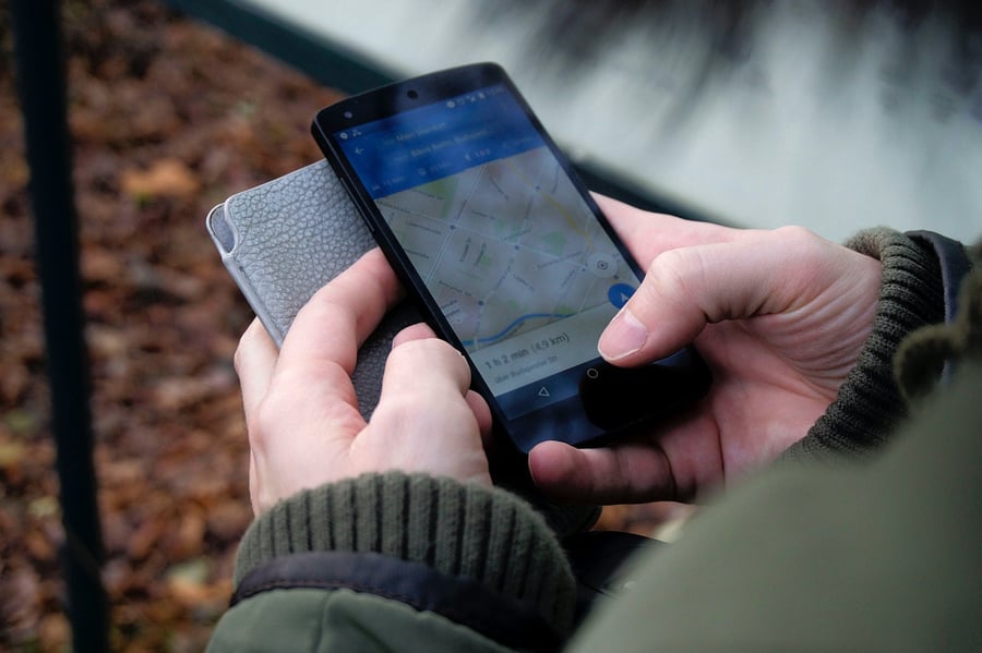
In a world where unlimited information is available at our fingertips, one of the most important features to include is mobile outage management. Here we’ll discuss the importance, benefits, and challenges of a mobile outage map.
Why being mobile-friendly is so important
If your utility company hasn’t gone mobile just yet, you’re not alone, but you should consider that customers using their utility provider’s mobile app have 15% higher measures of loyalty than customers who do not.
By creating a mobile-friendly platform, you can expect to see:
- Improvement in customer experience
- Increased customer retention
- Easier transactions
- Greater operational efficiency
- Improved customer safety (notifications about storms, accidents, and work areas share information that can provide warnings and offer helpful instructions)
- A reduction in call center volume
What’s more, creating a mobile app means you’ll increase the amount of data you’re collecting.
Why is that a good thing? Because having more data gives you a better understanding of your customers, which leads to better-informed decision making.

The benefits of mobile outage management
A critically important feature for your mobile experience is outage reporting and tracking.
Why? Put yourself in your customer’s shoes.
You’re at home enjoying a rainy, relaxing Friday evening on the couch, binge-watching the latest hit show from your preferred streaming service. Then, without warning, the power goes out and you’re stuck sitting in the dark.
Do you walk over to your desktop computer or laptop to check what’s going on? Or do you reach for your phone, which is likely already in your hand?
Logically speaking, customers are far more likely to use a mobile device during outages than a laptop or desktop computer. Because of this, it’s important to make sure your outage management system is optimized for mobile.
Here are the benefits you can expect from a mobile outage map:
- Happier customers
If your customers can't figure out how to report an outage from their phone, they're going to be even more frustrated than they likely already are. An outage map keeps them informed and can provide a sense of comfort and relief during a frustrating time. - More data means simpler + faster restoration operations
Rather than receiving information from a dispatcher, crews can pull data directly from the app, like location, cause, and potential fixes. This increases efficiency and leads to another benefit to customers - faster restoration times. - Ability to incorporate calls-to-action (CTAs)
With a mobile outage map, you can insert powerful, highly-relevant CTAs into the customer experience. For instance, you could have a button or pop up that encourages the user to sign up for outage alerts or to download your mobile app. - Reduction in call center volume
By making it simple and intuitive to report outages from your app, customers won't need to slam your call center during an outage event.
“In a lot of the usability tests we’ve run for our utility clients, participants have independently brought up how much they like the outage maps,” said Mindgrub’s Creative Director Shannon Hosmer.
![Related content: Custom Mobile App or Off-the-Shelf for Your Utility? [A GUIDE]](https://no-cache.hubspot.com/cta/default/2247038/e4c6a7b5-e5a5-479b-ae95-968db7864607.png)
Mobile map challenges
As anyone who works in user experience design will tell you, maps can be a particularly challenging feature to optimize for mobile. Let’s look at a few of the reasons why:
- Screen size
Maps provide a wealth of information—nearby businesses, street names, traffic, terrain, and more—but even with phones that have larger displays, all of that helpful information can quickly clutter the screen, leading to cognitive overload. - Controls
Think about how you interact with a map on the computer. You can left-click, right-click, mouse over, click + drag, scroll, and use the keyboard. With a phone’s touchscreen, you lose most of those abilities. - Toolbars
A legend, guide, or toolbar, can provide instructions for interacting with the map as well as additional functionality, however, they take up a lot of screen real estate. Toolbars should be positioned in such a way that it’s far enough away from the map itself so it doesn’t interfere with the user navigating the map. Ideally, it should be as simplified as possible, while still accommodating easy interactions for the user. - Touchpoints
Touchscreens are not the most sensitive. It can be challenging to click on a small, specific pinpoint on a map, especially if the map is overcrowded with information. - Slow networks
Slow network speeds can cause delays in the time it takes the map to adjust to your gesture. This in turn leads to the user redoubling their efforts, which becomes a source of frustration.
Creating a User-Friendly Mobile Map
Challenges aside, it is possible to create a mobile map that is user-friendly. We consulted with two of our experts, Creative Director Shannon Hosmer and Design Director Nicolette Cornelius, to pull together this list of best practices for designing a mobile-optimized map for your utility.
Advice from our UX pros
- Consider the customer’s state of mind.
When designing your map, the first thing you should consider is the customer’s mindset. “This should be number one,” said Shannon.
People need to have power. Making outage reporting and mapping as seamless and easy as possible to use is the best way for a utility company to show their customers they really care. - Design for mobile first.
Gone are the days of altering your desktop platform to fit on mobile. Nowadays, it’s far easier to design for mobile first and then adapt that design to desktop. And with the majority of traffic coming from mobile, why wouldn’t you?
“People devote less time and attention to mobile, they're more distracted, so we need to design for mobile: more lightweight and transactional.” - Shannon
When it comes to critical functionality, it’s important to make sure your mobile experience is in alignment with your existing platforms. You want your mobile site or app to be at least as good, if not better, than your website. Otherwise, your users will revert to other methods of reaching out, like social media and call centers. - Make it easy to get help + to exit.
In other words, don’t block the exit. This is a standard user-experience best practice. You don’t want to design an element the user can’t figure out how to use or can’t exit once they’ve entered. Always offer guidance along with an easy way out. - Don’t overwhelm your map with buttons and toolbars.
When you’re working with small screen sizes, every bit of space counts. You want your map and controls to work together, not to fight each other. User interface elements should support what’s on the map without taking away or covering up vital map data.
One way to do this is by allowing the user to hide or minimize any controls, so when they don’t need to use them, they’re out of the way (but are still easily accessible). - Keep accessibility in mind.
It’s important to ensure that everyone is able to access your mobile site or app, regardless of their mental or physical ability. While difficult to implement, accessibility is worth your consideration when designing your outage map.
For instance, will a user with a visual impairment be able to glean any information from your map? Consider nudging them towards a less visual representation of the data. Make sure you have an alternative method of viewing outage information, such as a chart or report, that can easily be understood with the help of a screen reader.

-
Keep it simple.
The most successful UX utilizes what users are familiar with. Sure, you could get creative with your gesture controls for your map. You could tell users to triple tap to drop a pin or to draw a circle with two fingers to rotate the map. But, the bottom line is, only a few types of gestures are common.
Take advantage of common map interaction paradigms that customers are familiar with. Reference Google and Apple maps to see what users are expecting. Align the functionality of your map with Apple and Google, so your users won't have to learn anything new when interacting with your map.
“Don’t reinvent the wheel just to reinvent it. Be selective in how you choose to innovate.” - Nicolette
You’ll have a more user-friendly map if you keep it simple and intuitive than if you create your own set of original gestures.

