Let’s admit it.
While more convenient than completing paperwork by hand, filling out long online forms is a drag. It’s a pain. What’s more, it can be downright infuriating if the form isn’t well designed, making you long for the days of pen and paper.
To help all of you who are wishing it was easier to make forms, well, easier - we’ve got the answer for you right here, in 18 points. That sounds like a lot, but these are easy to understand and worth implementing.
Why? Because the goal is to make things as easy as possible for your user - especially when it comes to tedious long forms that gather the precious information, and sometimes money, that your company depends on.

What if I don’t want to optimize my forms?
Think your long forms are just fine, thankyouverymuch? That they don’t need optimizing?
Take a look at how bad form experiences could be impacting businesses in your industry:
- Education: late or missing tuition payments; even missed applicant and enrollment opportunities
- Government: lost or missing revenue from permits, licenses, citations, or other collections
- Energy: lost or missing revenue from utility fees
- Health: difficulty collecting health history or insurance information; incomplete health histories for new and existing patients
- Retail: loss of information if users are unable to or choose not to complete loyalty program sign up; loss of revenue from cart abandonment
Not to mention all of the extra work for your customer support team, who will be handling the increased volume of calls and complaints from those who are fed up with your fickle forms.
Don’t let your customers pine for pen and paper. Take a look at how your forms are set up, and see if they meet these 18 best practices.
Best practices for long forms
1. Make. It. Mobile. Friendly.
Guys. It’s 2019 2020. If your entire website isn’t mobile-friendly, you’re way behind the times. (Don’t worry, we can help).
One-in-five US adults are smartphone-only users - meaning they have no access to a desktop computer. If your forms don’t work on a small screen, 20% of adults won’t be able to fill them out. If ⅕ of the US population isn’t a good enough reason to go mobile, I don’t know what is.
2. Set expectations from the start
Your users should know what they’re getting into. Before they enter your form, answer these questions:
-
-
-
- Why does the user need to complete the form? What will be done with the information?
- How much time (approximately) should the user spend completing the form?
- Do they need supporting materials such as a driver’s license, a credit card, or their insurance policy information?
- What are the next steps after completing the form? Do they need to take further action? Should they anticipate a confirmation email or follow up call?
- Will the form autosave if they need to leave, or accidentally exit?
If you don’t share this information, your user may not allot enough time, will be frustrated they have to keep getting up to fetch various documents, and will definitely be mad if they have to leave and lose all progress.
- Why does the user need to complete the form? What will be done with the information?
-
-
-
-
-
Set expectations before the user enters the form. Your user will appreciate your openness and honesty and will be able to prepare accordingly.
-
-
3. Track progress
Don’t stop there - once you’ve set expectations for how long the survey will take, keep users aware of how far along they are in the form.
Include a progress bar, section stepper, completion percentage, or other measure that tells the user how close they are to completing the form. For really long forms, you could even use a table of contents style checklist on the side, so the user knows what step they’re on and can easily refer back to other sections.
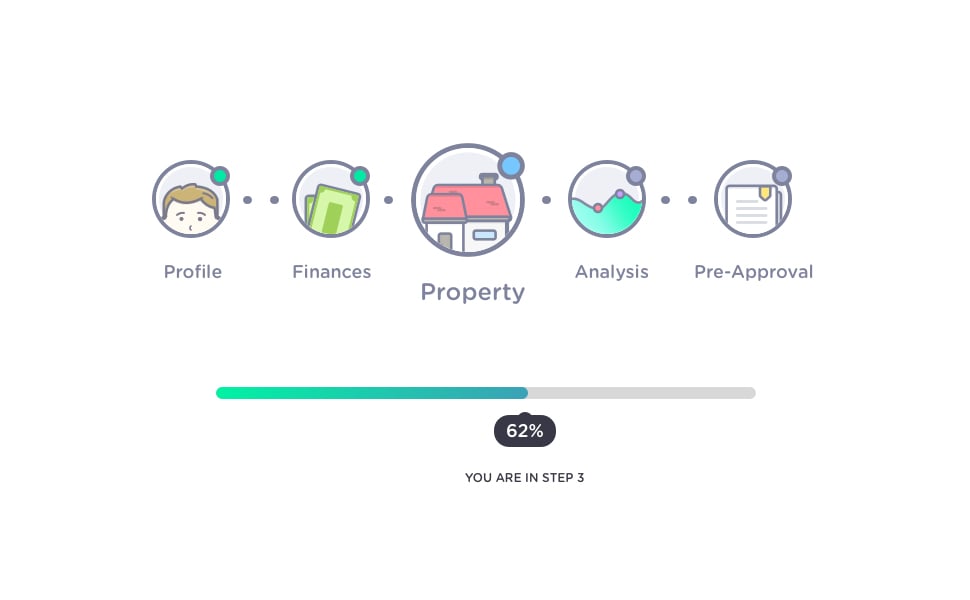 Source: Dribbble.
Here is an adorable example of a progress bar that shows the numerical step the user is on (3 of 5), the category of the step (property), and the completion percentage (62%).
As the user progresses, the tracker will update, giving them a clear idea of how much time they can expect to devote to finishing the form.
As an added bonus, your user will feel a sense of accomplishment as they check off each section.
4. Group questions into easy-to-digest sections
Opening a form and discovering a near-infinite scroll of question after question is daunting and discouraging. Your user is filled with a sense of dread, and thinks greaaat, how long is this going to take?
To avoid frustrating your user before they even begin inputting information, break up your form fields into logical groups. Then, use these sections in your progress tracker to make the whole process seem more manageable.
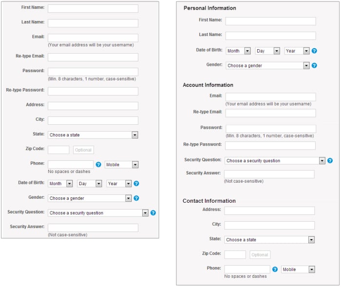 Source: Nielsen Norman Group.
Here’s what that looks like in practice. See how much easier the information on the right is to digest?
5. List questions in order of difficulty
Start with the easy questions, like name and email, before moving on to the more difficult or time-consuming ones. You wouldn’t start a conversation with a stranger with a deeply personal question. You’d start by getting to know them.
This is also a sneaky tip to draw users into your form. Once they start filling out the easy questions, they’ll feel like they’re on a roll. They’ll feel compelled to keep going, so you want it to be as easy as possible to get started.
6. Use one column (it’s easier on the eyes)
Keep all your form fields in one column, straight down the page. It’s much easier for your brain to process. Think about a grocery list: would it be easier to read a list of items in written out one after the other like a sentence? Or in a bulleted list? Think of a form in the same way.
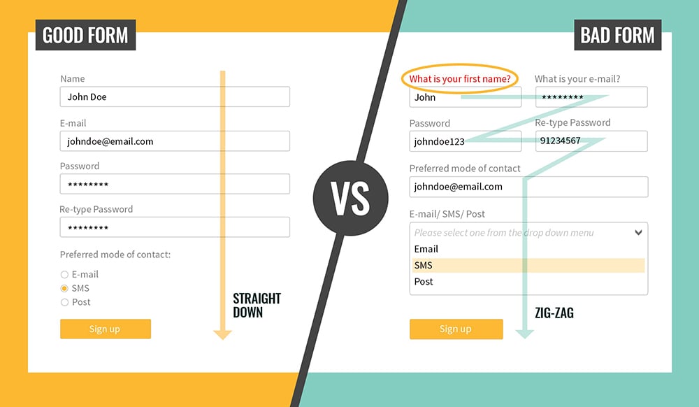 Source: Medium.
Keeping your form fields to one column also makes for a better display on smaller screens, like smartphones.

7. Enable tabbing from field to field
Isn’t it nice to be able to tab from field to field, and not have to reach for your mouse or click around?
Certainly convenient, this is also a very easy way to make your form more accessible. Enabling tabbing through the fields means users who rely on a keyboard to browse the web can navigate your form with ease.

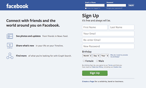
8. Don’t put form labels or instructions in the answer field
Label your fields above the field, and don’t use any placeholder text. In other words, leave the input space completely blank.
 Source: ZURB.
Take a look at this old Facebook sign up form. That placeholder text will disappear when the user clicks into the field, meaning the user could forget what they are being asked to input, or how their response should be formatted.
Avoid errors and mistakes by keeping labels and informational text outside of the field. If you must use placeholder text, for instance, to avoid making a form look cluttered, make sure that it doesn’t disappear when the user starts typing.
9. Offer instructions on formatting
How many different ways can you think of to format a phone number?
Area code or no area code? What about country code? Parentheses around the area code, or just hyphens? You get the point.
Avoid confusion by providing instructions for how you would like responses to be formatted.
Alternatively, consider autoformatting, either via your code or a third party service. Autoformatting means the user can start typing, and their entry will be automatically adjusted to match the desired format. Watch it happen in the gif below.
 Source: UX Movement.
Receiving vague error message after error message because you can’t guess the correct phone number format is incredibly frustrating. Make it easy by telling your users exactly how to format - or by doing it for them.
10. Don’t ask for a phone number if you don’t need it.
In fact, don’t ask for any information you don’t really need.
With spam calls more frequent than ever, people don’t love to give out their phone numbers - especially when they’re already giving out other ways of getting in touch (like their email).
In general, try to ask for the bare minimum. Long forms are a pain; don’t ask for information just for the sake of having information. If you discover later on that you do need that data, you can always edit the form. You don’t have to gather every piece of information on your user at once. Build a user profile over time and avoid scaring users off by asking for too much at once.
11. Label optional fields
Rather than marking the questions that are required, label those that are not. If you’re following #10 above, nearly all of your questions should be required, so it makes more sense to mark the ones that are optional, rather than placing a red asterisk by every one of the fields that are required.
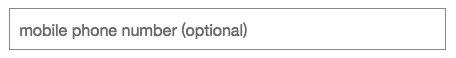
12. Use summary boxes
Ever been filling out a form and thought, “why do I need to provide my phone number?” or “what are they going to do with my email address?”
A summary box is a great way to address concerns and add clarity. You can say, “We’ll only call you if there is an issue with your order” if it’s a payment form or, “We’ll send you a text to confirm upcoming appointments” if you’re a doctor’s office.
 Source: Medium.
This example from Facebook clearly and succinctly explains why they request the user to input their birthday. Using summary boxes increases transparency and lets customers know exactly how you plan to utilize their personal information.
13. Enable autocorrect
This is imperative for mobile forms. Enabling autocorrect can prevent costly mistakes and save time.
14. Enable autofill
Allowing users to auto-populate basic fields like name, phone number, and address makes filling out long forms a breeze. The process goes by so quickly, and the user appreciates not needing to type out their full name, email, address, or billing information for the zillionth time.
15. Put a positive spin on your error messages
No one wants to read “INVALID RESPONSE” in angry bright red letters. When writing your error messages, avoid being vague or placing blame. Instead, be clear, polite, and helpful.
For instance, instead of saying “invalid input” say “please format the date as MM/DD/YYYY.”
HubSpot has a great list of error messaging dos and don’ts if you need more helpful hints.
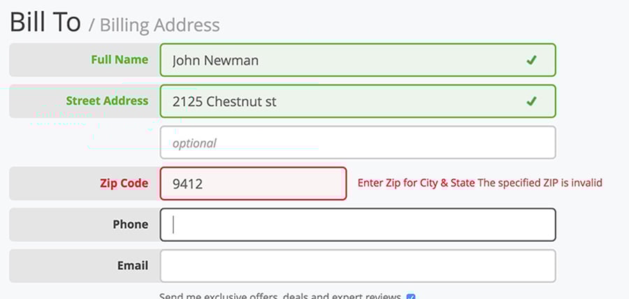
16. Inline form field validation
While you’re working on error messaging, it’s a great idea to implement inline form field validation.
In other words, tell the user right away if their entry is incorrect, rather than sending them back after they’ve completed the form.
 Source: Baymard Institute.
In this example, the user is told as soon as they click into the next field that the previous field contains an error. It’s important to make sure your error message doesn’t show up prematurely, i.e. while the user is still typing. You’ll also want to double-check that the error message disappears once the entry is corrected.
17. Make them accessible!
Accessibility can benefit everyone, and it’s worth taking the time to make your forms available to all users.
If you work in the public sector, you’ve probably heard of Section 508 of the Americans with Disabilities Act. This requires that all government agencies make their electronic information accessible to people with disabilities.
While Section 508 does not apply specifically to the private sector, following accessibility guidelines (such as the Web Content Accessibility Guidelines) will make your website and forms more inclusive and will improve usability for each and every one of your users.

For example, say you work in healthcare and are creating a form for inputting health history. Wouldn’t it be a good idea to follow accessibility standards, so that any user - regardless of his or her impairment - could complete your form? If a patient with an impairment was unable to access your medical form, they might leave and choose a practice that is more inclusive of those with different abilities.
The same is true in any industry. You wouldn’t want to prevent some users from accessing your forms, and since designing for accessibility benefits all users, why not strive to meet those WCAG standards?
18. Above all: Keep it simple always
The most important thing when it comes to long forms is to keep things simple. Don’t overcomplicate it. Look your forms over through the lens of common sense.
How did your forms stack up?
Did you check off all 18, or do you have some new tactics to implement? Share your score in the comments below!
Want to literally check off best practices as you implement them? Download our printable checklist.
.png?width=75&name=msprinkle%20headshot%20circle%20(1).png)
