The State of Sketch Symbol Meta

“This process isn’t perfect yet.” - All of us, all of the time.
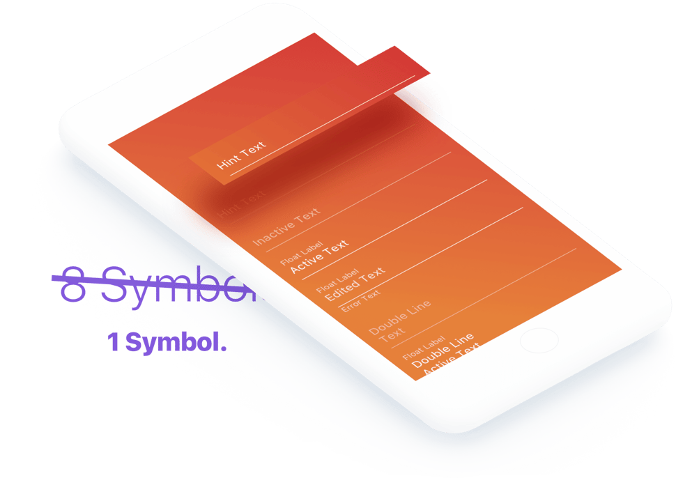
My Sketch symbols dropdown, even in peak organization, is a bit of a bloated mess. How about yours? Let’s cut down on wasted naming conventions and legwork; let’s use one symbol for all of our fields. We’ll accomplish this by laying all the components of the various input fields together on one symbol and then layering them correctly.
Layering
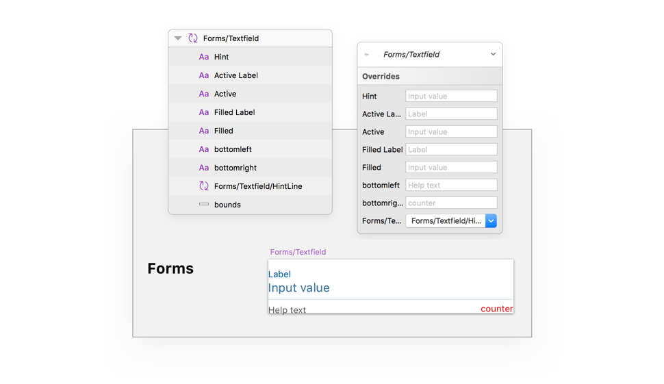
Ordering your layers meaningfully is simple; I’d recommend following the semi-chronological order of the Google Material Design ‘Text Field States’ section. Notice that the order of the layers within the symbol controls the order of the Text Overrides in the information panel.

Practice
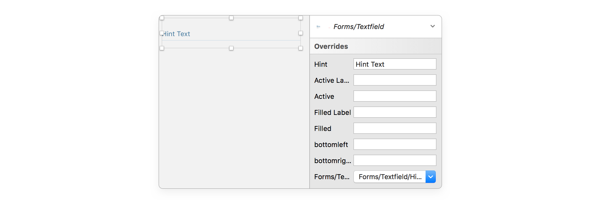
If you slap your Input Field into your document in its current state you’ll see all of the various styles overlapping and generally looking awful. Slam your spacebar once in each symbol override box and the text will disappear. Here’s an example of a pre-interaction text field’s setup:

Problems
Before we get wild in here, there’s an important cautionary step you need to take if you’re using Zeplin, Sympli, Invision-Inspect, or any type of design-dev-handoff tool. These ultra-layered symbols really mess with the information displayed to developers. The solution is simple though; throw all of your text field states into an artboard alone and make sure to let development know where it’s located so that they can make ‘library’ components with the text fields. Easy.

Double Line Nightmare Mode
Time to get wild in here! Anima’s advanced layout features aren’t so complicated that they need their own tutorial at this point, but the application of Anima inside of your basic text field symbol is so awesome it does need its own shout-out.

Sketch symbols aren’t meant to adjust based on the length of text, but Anima’s Stack-Group designation feature does this.
Anima Stacking
Install the Anima plugin, ignore (for now) all the Launchpad features (these are for publishing HTML from Sketch, pretty cool tbh), and just select your text, your hint-line/active-line/etc., and click the folder icon. This will create a stacked-group which will keep these two items related to each other.
Your spacing will depend on your designs, but I’ve found 8pt to be acceptable to both iOS and Android users. This stage is where you’ll have to do some testing if the hint-line/related-object falls outside of the parent-symbol’s artboard. Normally symbols aren’t supposed to cut things off, but Anima might cause some strange interpretations of Sketch’s rules.

Further Information
Check out this Medium Article for an in-depth look at the Anima Auto-Layout plugin. It’s one of the most powerful things surrounding Sketch, and if the past is any indication of the future, these functions will eventually make it into a vanilla Sketch release.

