How to Navigate iPhone X's New Layout Features
New Features Cause New Issues
Apple just announced their new line of iPhones, and the big standout this year is the new iPhone X (pronounced iPhone Ten). The iPhone X has all of the same features that the new iPhone 8/Plus phones have (faster processor, better cameras, wireless charging, etc.), as well as a brand new edge-to-edge super retina display. Based on a review of these new features and the new retina display, there may be issues with some existing applications that you should be aware of.
A Larger Display
The new display is slightly larger than the Plus’s 5.5” screen, measuring in at 5.8” diagonally, but has a form factor similar to the non-plus models. The display remains the same width pointwise, but there is roughly 20% more vertical space.
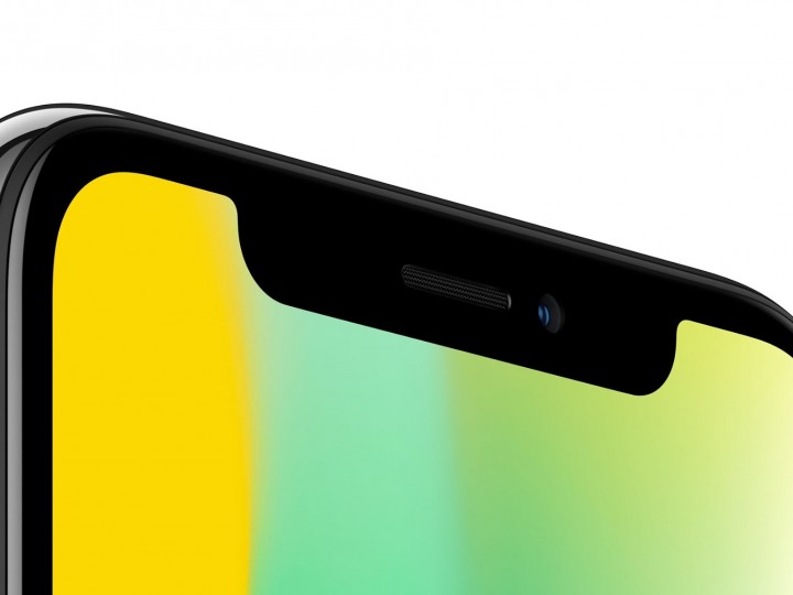
In addition to the larger screen size, the corners of the display are rounded, and there is a “notch” at the top of the device that holds all of the front facing hardware. Because of this, Apple has introduced what they are calling a “Safe-Area”.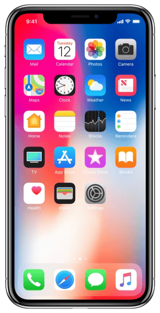
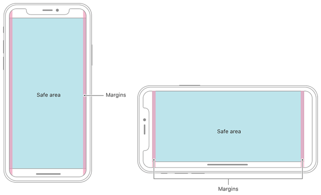
The new safe-area is the rectangular portion of the screen in which Apple would like for all content to go. This does not mean that the full screen shouldn’t be used, it is more of a guideline on where to place all actionable and/or important information to ensure all of the content will be visible.
Potential Issues with Applications
With all of the new layout changes, there is potential for issues with existing applications. One issue that most applications will encounter is a gap that is now visible below the views on the iPhone X. This stems from the device rendering an old rectangular view inside of the new safe area.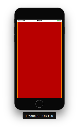
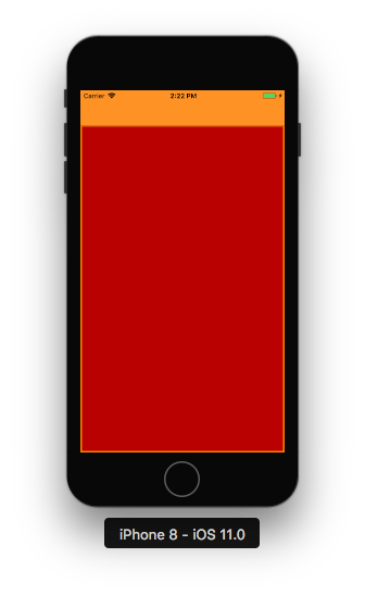
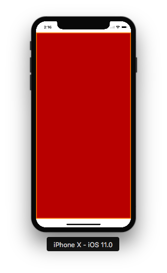
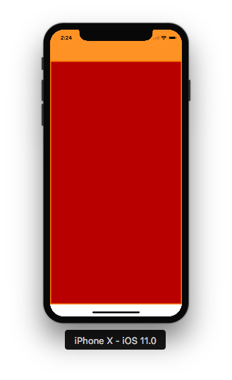
The diagrams above show how the same view will display on both a standard sized iPhone 8 screen and the new iPhone X screen. The set of images on the left depict a view that does not contain a navigation bar. The top of the screen remains relatively unchanged between the two devices. However, due to the safe areas, the bottom of the iPhone X’s view is offset from the bottom of its screen. The images on the right depict the same view, but with an orange navigation bar. Again, the top of the view is relatively unchanged, and the bottom becomes offset. The difference here is that the bottom empty space remains white, even though the navigation bar and status bar are not. Additionally, if either view contains vertically scrolling content, the content will no longer scroll off the bottom of the screen, but instead will be cut off at the start of the offset area.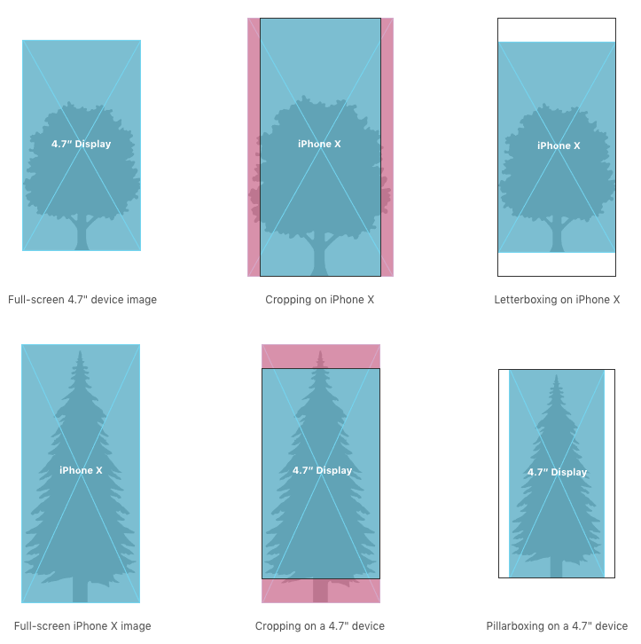
Another thing to look out for are layout issues involving existing artwork. Since the iPhone X’s screen is ~20% taller, the aspect ratio has changed. This may cause issues with artwork that was designed using specific aspect ratios. Depending on the scaling mode and native image size of the art asset, views may become stretched, cropped, or pillar/letter boxed.
Which Apps Might Be Affected
The examples listed above are just a few of the issues that may arise from the new iPhone X layout. Applications that have been continually updated and follow proper iOS user interface guidelines will most likely experience minimal issues. The applications that will see the most issues are those that use custom navigation views or those that had hard coded values for UI element sizes in them. More information regarding the human interface guidelines for the iPhone X can be found in this link.
There is a potential for older applications to experience more issues with the new layout than those that have been updated on a regular basis. Throughout iOS versions, Apple has adjusted how the system lays out views a few times. Because of this, older versions of apps may not scale properly, causing views to become stretched or areas of the screen to be empty. For a look into the exciting updates on iOS 11, including ARKit and CoreML, visit my colleague's blog here.
Resolving The Layout Issues
The good news is that most of the issues caused by the iPhone X’s new screen are easily rectified. Most of them are minor layout issues that can be fixed by adjusting the view’s layout files in the code. More severe cases may require more effort to fix, but those types of issues will hopefully be few and far between.
