Designing Digital Products for Kids (and Their Parents)
 Common Sense Media compared studies from 2011, 2013, and 2017 and found that the way U.S. children eight years of age and younger are using digital media has changed significantly over time.
The average amount of time kids spent on mobile devices per day was nearly ten times higher in 2017, compared to 2011.
Mobile devices are also (not shockingly) increasing in popularity among teens. According to Pew Research Center, 95% of teens (ages 13-17) in the U.S. have their own smartphone or have access to one; this figure is up 22% from the same survey conducted four years ago.
With the likelihood that children’s screen time will continue to climb, how should organizations and educational institutions design and market their kid-focused digital products?
Good design starts with knowing both your target audience and your end user.
In the case of websites and apps for children, the target audience (their parents or guardian) is actually different from the end user (the child), so particular consideration must be given to the expectations and abilities of both groups in order to be successful.
Do your homework
It’s easy to fall into some assumptions when designing for a web, mobile, or other digital product for kids. Here are four important factors to consider before drafting up any designs:
- Age matters
Something designed for a pre-teen would likely not be a good fit for a toddler because of things like vocabulary, attention to detail, and coordination. However, don’t let that deter you from creating a bit of a challenge for them.
Children like to learn new things while also exercising what they already know. The key is to gradually introduce complexity by breaking things up into sections, stages, or levels.
- Project goals
Once you know exactly what type of product (e.g., website, game, learning tool, social platform) you are designing, you will need to discuss the details with your team to make sure everyone involved is on the same page. The goals should be clearly identified and documented.
Throughout the process, you’ll want to refer back to this documentation to see how your progress stacks up.
Setting clear expectations up front will help make the purpose of the product shine through in your design, and ultimately to the user. You don’t want children or their parents/guardians to be confused or bored by your product.
- Know the law
Are you familiar with the Children’s Online Privacy Protection Act (COPPA)?
COPPA protects children under 13 years of age when they use programs and services online. Compliance requirements include, but are not limited to:
a complete privacy policy,
notifying parents directly about information collection practices, and
receipt of verifiable parental consent before collecting or sharing personal information from their children.
Fines for violating COPPA can reach into the millions of dollars.
Rules and restrictions regarding online privacy and user protections are constantly changing. Make sure you know what is, and is not, acceptable for the project you are working on; consult a legal expert if needed.
- More protections
Children are very trusting and don’t always understand the ramifications of the actions they take. Safeguards must be built into the designs of digital products to protect younger users from making mistakes that put them at risk.
For example, if a digital product allows for purchases with real currency, the design must first require parental consent (e.g., a password, re-entry of the last four digits of the bank/credit card account). When it’s too easy to spend money, kids will probably not understand what they are doing and could rack up some serious charges!
You can almost guarantee that the first time accidental purchases are made, the parent will uninstall, get rid of, or otherwise not allow the use of that program or service.
Tailoring design elements
Okay, now that we’ve covered some ground rules, let’s take a look at what can help you provide the best designs for your digital product.
Interactive and functional features
If you can create a way for kids to interact with your digital product, it will go a long way.
Most kids now expect that they will be able to tap a screen to make something fun happen. Animations, audio, videos, gamification elements, and buttons can all help with this.
Incorporating audio or a video will be helpful to replace or be used in conjunction with text for younger children still learning to read. This becomes especially important for games so that users understand how to play. But remember to keep instructions straightforward and easy to follow.
Consider the fine motor skills of your target age group(s). Large arrows and buttons will be easier for younger groups to use compared to swipe or zoom.
The actions you want users to take also need to be obvious, without the distraction of or accidental clicks on too many menu options or features around the edges of the screen.
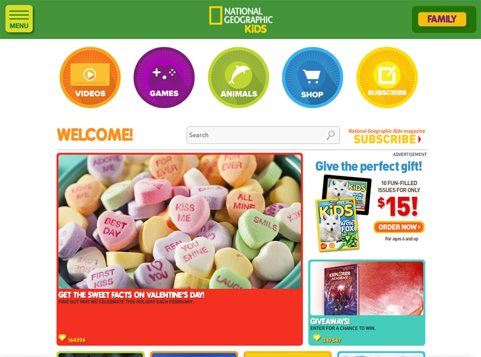
National Geographic Kids has a website that provides a good example of how to use icons and clickable videos for children. These areas are large, colorful, and easy to identify.
 National Geographic Kids home page.
Immersive experience
Successful websites, apps, and games give children the opportunity to explore and become part of a storyline or virtual world. Characters, settings, sounds, actions, and narration are elements that make an immersive experience possible.
As virtual reality (VR) continues to grow and become more accessible, we can expect that children will want more of this in the products they use. Designers will need to keep new technologies and trends like VR in mind to stay competitive in their markets.
Typography and colors
The use of simple typography (e.g., sans serif) and bright, contrasting colors is usually a good general rule to follow when designing for younger audiences. It’s no secret that kids are more likely to gravitate towards something that is easy to read and has vibrant colors rather than something difficult and bland.
Also consider offering a bit of interactivity here. Kids certainly like to personalize things so allowing them to choose colors for certain things (e.g., profile features, characters) will create some fun for them.
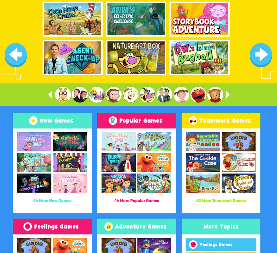
Here’s a good example of how to use color from PBS KIDS.
 PBS KIDS games page.
In her book The Art of Screen Time, author Anya Kamenetz drew upon journalist Michael Pollan’s nutrition advice (“Eat food. Not too much. Mostly plants.”) to create a new mantra for parenting in the digital era: “Enjoy screens. Not too much. Mostly together.”
How can you create an experience that encourages parental or teacher involvement?
Whether by creating a character for an adult in your storytelling scheme or incorporating prompts for child/parent conversations or activities, any opportunity for joint engagement is also an opportunity to increase the adoption of your product in the face of growing concerns about screen time.
Furthermore, adults (i.e., parents, grandparents, guardians, teachers, counselors) are often the ones children turn to when they get stuck, so those folks need to understand how it works, too.
Whether it’s instructions on how to play a game, fields to fill out for an avatar profile, or an entire section to help parents understand the system, consider how areas designated for adults can be incorporated into your designs to give them a quick understanding of how to best support their child.
Screen breaks
While it’s natural for businesses to want digital products that engage kids for extended periods of time, it’s also important to make sure kids are being prompted to take breaks.
As adults, it’s our responsibility, no matter what role we play, to ensure children are getting enough time away from digital screens. Playing outside, socializing with family and friends (not the media kind), and establishing healthy habits are all important for growing minds and bodies.
Looking at a screen without taking breaks can cause several issues, including dry eyes, eye fatigue, blurry vision, and myopia.
The least we can do when designing products that contain lots of digital content is include well-timed breaks throughout a user’s session. It could be as simple as timing out the system after a set number of hours or changing the screen to display “break time” which doesn’t go away for awhile.
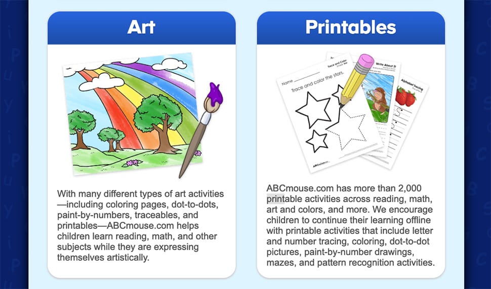
Another way to encourage screen breaks is to incorporate printable worksheets. ABCmouse has printable (offline) coloring pages and worksheets for kids to complete as part of an ongoing curriculum. The user will log back in after they complete the worksheets to record their progress.
 ABCmouse home page.
Always be testing
We were all kids at one point, but that certainly does not mean we can think like them.
If possible, set up separate sessions with kids, parents, and/or teachers in a few different contexts to gain valuable insight about how your product is being perceived and used. This information can help you make improvements, or send you back to the drawing board.
Until next time
Designing a digital product for people under the age of eighteen can seem daunting at first.
Remember the list of ten best practices:
- Introduce complexity in stages
- Adhere to relevant statutes & regulations
- Maximize interactivity
- Choose clickable elements over swiping or zooming
- Use storytelling to create an immersive experience
- Offer personalization through color and character play
- Utilize high contrast colors and simple typography
- Consider how parents or teachers will interact with your product
- Incorporate screen breaks
- Conduct user testing sessions
Gather critical pieces of information in regards to your users’ age range, your project goals, any relevant privacy laws, and required safeguards to keep kids safe, and you’ll be off to a great start.
Once you begin your design work, refer back to the best practices discussed here as needed. You’ll have a product that’s ready for the world in no time, but remember to test, test, and test again. As kids become more and more tech savvy, their expectations and needs will change too.
Interested in talking to an expert about your digital product? Let us know and we’ll set up a time for you to speak with our design team.


