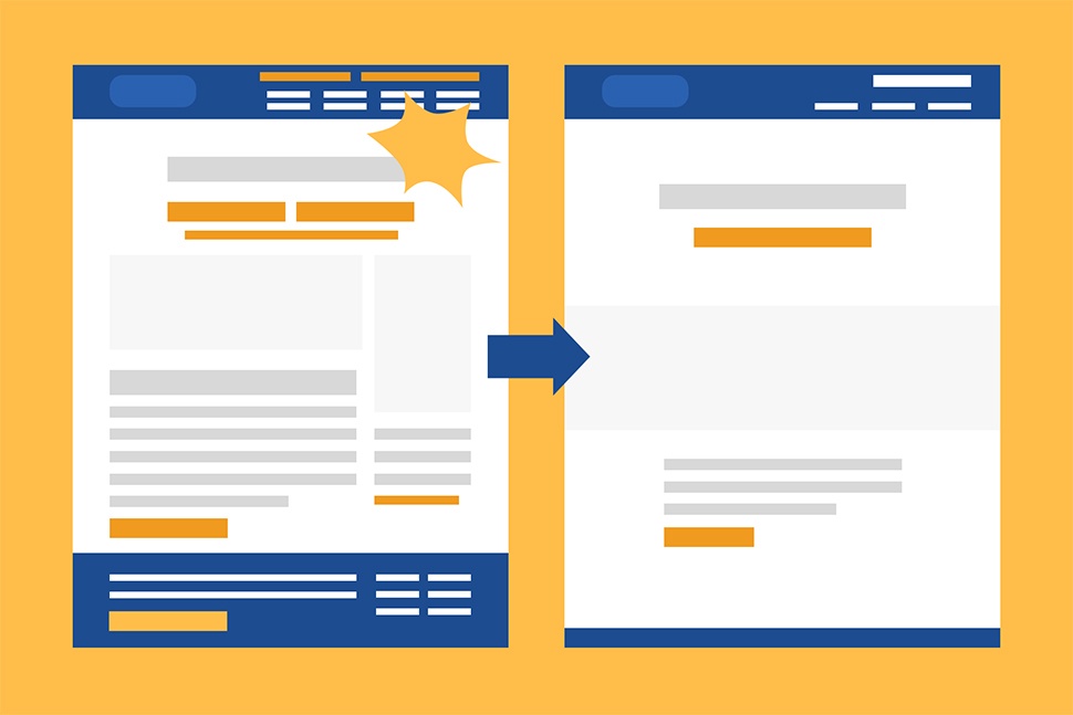
6 Steps to Effective Design
 From confusion to cohesion: Reducing noise allows your message to be communicated more clearly.
In the years I’ve been working on interface design, I’ve noticed an obsession with including everything “above the fold.” The theory here is that users will arrive at your website, view content that is “above the fold,” and make an unconscious decision about staying there (or not) in about three seconds.
To compound the issue, users are often navigating while distracted by a constant barrage of stimuli, so you’re unlikely to have their full attention. As a result, clients and project teams feel immense pressure to cram everything above that invisible line.
Not only is this ineffective because “the fold” is dependent on screen size (and, therefore, never consistent), but it is also counterproductive. Instead of making all the features and pages easy to access, it becomes confusing and overwhelming for one reason: cognitive load.
What is cognitive load?
Humans have a finite cognitive load, which is the amount of mental processing power needed to learn new things (e.g., navigating your website).
A minimal amount of cognitive load is needed to absorb new information. However, when we’re presented with more information than we can handle at once, it takes up extra mental resources without much benefit.
Have you ever found yourself standing in a store paralyzed by the sheer number of choices you have? That’s caused by extraneous cognitive load. We take longer to absorb the material, miss important details, or just give up because of how overwhelming it is.
In effective design, the primary action we want people to take must be obvious and featured prominently. When placed next to five other prominent features, however, they all fight for our attention and basically cancel each other out.
It’s like trying to have everyone fit through a door at the same time - not going to work.
So what can we do to make it easier for the user?
Here are 6 steps to help achieve effective design
1. Focus on the main goal
What are we trying to accomplish? Simplicity is always best, and by having one main focus, we make our message clear. Our calls to action should be concise and focus on the one goal of achieving that purpose.
2. Cut out everything that’s unnecessary - Occam’s Razor
If it doesn’t support the main purpose or isn’t necessary for the product to function, it’s only adding noise. We don’t want people to get lost in the options.
3. Make sense
Work off existing mental models and make sure to use terminology people would immediately understand.
Getting fancy with brand labels or including a lot of industry jargon in your content might be acceptable, but if it gets in the way of people understanding your app or website, it isn’t worth it.
There are always other areas of the product where branding elements can be applied with more success.
4. Consider hierarchy
Do a squint test.
- Is the most important element the first thing you notice?
- Is anything pulling your attention away?
Each element in the sequence should lead the user closer to taking the desired action.
5. Maintain Balance
While it’s great to have your message be clear and obvious, we don’t want to be obnoxious.
- Tone down anything that seems too loud.
- Keep the overall visual language consistent.
- Add in more white space and visual breaks to ensure an easy read. White space isn’t wasted space. It’s important to help lead the eye and it can actually give a sense of elegance and quality, whereas poor use of white space can make a brand appear to be low quality.
6. Entice the audience
Take advantage of other design principles such as the rule of thirds or the golden ratio to make engaging layouts. Keep text short and simple. Consider color psychology and theory to ensure the right message is being conveyed between the lines.
Keep in mind: All of this means nothing if the design and content aren’t engaging.
Putting it all together
Effective design is a careful balance of visual and user experience design.
A page could have amazing visuals but poor user experience, which could lead to confusion or missed clicks. However, great content is just as important to make the experience worthwhile. All these elements must work together to guide users effectively.
By keeping the interface simple and direct, we make the experience effortless and, as a result, accomplish our goal that much more effectively.
Would you like help with your next design or branding project? Let us know.

